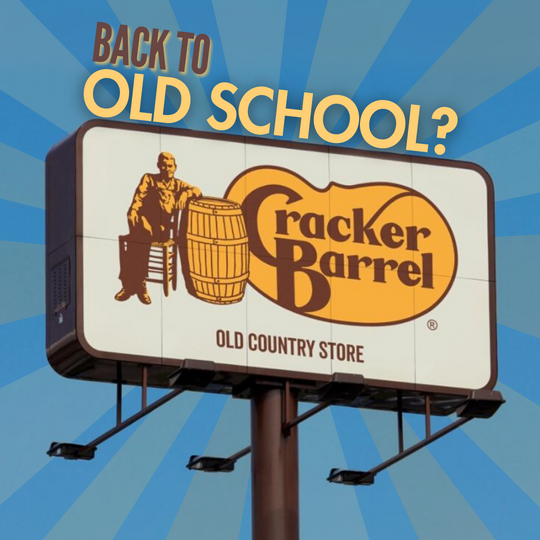
Cracker Barrel abandoned its new logo after backlash, restoring its classic identity as loyal customers and markets favored tradition over change.
What changed in the logo?
The redesign simplified the identity to a wordmark above a yellow barrel silhouette, dropping the iconic “Uncle Herschel” figure and the long-standing “Old Country Store” descriptor. While colors tied to menu cues were retained, the move reduced the distinctive storytelling elements that longtime guests associate with the brand.
Why the backlash escalated
Reaction across social platforms was immediate. Many viewers deemed the mark too minimal and devoid of character. The removal of legacy symbols was interpreted by some as abandoning the brand’s roots, fueling a wider cultural debate.
Wall Street’s response
Following Cracker Barrel’s decision to restore the classic logo, the company’s shares rose more than 8%, recouping much of the prior week’s slide and underscoring how brand sentiment can move markets.
Proposed new logo design for Cracker Barrel, 2025.
Company statement: listening to guests
“We thank our guests for sharing their voices and their love for Cracker Barrel. We said we would listen, and we have. Our new logo will disappear, and our ‘Old Timer’ will remain.”
Brand lessons
This episode highlights a core truth of identity design: logos carry memory. For heritage brands, removing storied elements can sever emotional ties and trigger backlash—online and on the trading floor. Cracker Barrel’s reversal reflects both the strength of its legacy and the growing power of real-time customer feedback in shaping strategy.
Boost Your Brand!
Request a personalized quote for your outdoor campaign today.
Contact Us
Have questions? Reach out via WhatsApp.
Chat NowFeatured Services
Ready to advertise outdoors?
BM Outdoor plans, buys and prints OOH campaigns across all 50 states. Request a free quote with no commitment.


Comments
Be the first to comment.