Mindful Chef, the UK’s premium healthy recipe box service, has unveiled a complete brand refresh developed in partnership with independent branding and design studio Mother Design. The new identity strengthens the brand’s point of difference by placing health, provenance, and quality at the heart of every customer touchpoint.
In a category often driven by speed and convenience, Mindful Chef is repositioning healthy cooking as something joyful, sensory, and deeply human — reconnecting busy consumers with real food and the simple pleasure of preparing nourishing meals at home.
Reclaiming joy in the meal kit category
Mindful Chef serves a modern, health-conscious audience seeking convenient solutions without compromising quality. Yet much of the meal kit industry has prioritized efficiency over care, leading to generic experiences, unclear ingredient sourcing, and reduced emotional connection with food.
At a time when many British consumers feel increasingly disconnected from real ingredients, Mindful Chef’s mission — “Eat well. Live better.” — brings focus back to from-scratch cooking. Its chef-developed, pre-portioned recipes are designed to reach the table in under 30 minutes while preserving transparency, freshness, and flavor.
“Yes, Mindful Chef”: elevating everyday home cooks
Mother Design’s creative platform, “Yes, Mindful Chef,” reframes the brand as a supportive sous-chef rather than a distant authority. The identity celebrates everyday cooks, empowering them to feel confident and capable in the kitchen without the pretension often associated with premium food brands.
Photography and tone of voice place the audience at the center of the story, highlighting real kitchens, hands-on preparation, and the joyful finishing touches that transform simple meals into moments of personal achievement and pride.
A color palette inspired by real ingredients
The refreshed color system draws directly from the richness of natural ingredients. Aubergine anchors the palette with depth and sophistication, balanced by Oat — a warm off-white that introduces calm and clarity. Fresh accent tones inject energy and modernity into the brand world.
Colors are often used to frame dishes like artworks, elevating produce visually while reinforcing Mindful Chef’s commitment to quality, beauty, and appetite appeal across packaging, digital platforms, and physical touchpoints.
Typography that behaves like flavor pairing
Typography plays a central role in the new identity, inspired by the visual language of culinary editorial design. Two expressive typefaces create rhythm, texture, and personality throughout the system.
Ostia Antica supports recipes, storytelling, and body copy with warmth and precision, while Bourrasque, a condensed headline typeface, delivers confident scale and energy. Their contrasting proportions function like a balanced flavor pairing, bringing visual dynamism and consistency across touchpoints. Motion design further extends the identity by wrapping typography around the edges of the recipe box, creating a distinctive brand signature.
Photography and art direction that put people first
The refresh introduces a renewed photography approach that emphasizes authenticity, tactility, and everyday environments. Rather than hyper-stylized food imagery, the brand captures real kitchens, natural light, textures, steam, and hands in motion — reinforcing the emotional pleasure of cooking.
The new visual direction was unveiled publicly through a nationwide feature in The Telegraph, signaling Mindful Chef’s ambition to position itself as a premium lifestyle brand rooted in genuine food culture and everyday creativity.
FAQs about this campaign
What is Mindful Chef’s brand refresh about?
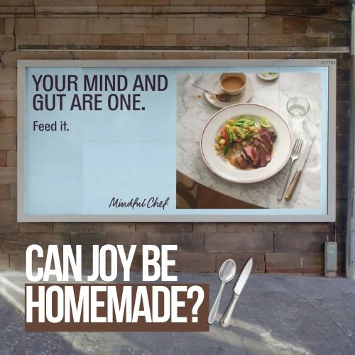
It’s a full identity refresh created with Mother Design that strengthens Mindful Chef’s positioning around health, provenance, and quality—making meal kits feel joyful, culinary, and premium.
What is the core idea behind the refresh?
The platform “Yes, Mindful Chef” elevates everyday home cooks, positioning the brand as a supportive sous-chef that helps people cook nourishing meals with confidence—without pretension.
How did the color palette change?
The palette was evolved to feel ingredient-led and appetizing, anchored by Aubergine for depth and sophistication, balanced with Oat for warmth and calm, plus fresh accents for energy and modernity.
What typography defines the new identity?
Two expressive typefaces inspired by culinary editorial design: Ostia Antica for recipes and body copy, paired with Bourrasque for condensed, high-impact headlines that add warmth and scale.
Why does this refresh stand out in the meal kit category?
Because it shifts the category narrative from convenience-only to care and craftsmanship—using design, imagery, and voice to make the act of cooking feel sensory, human, and worth the premium.
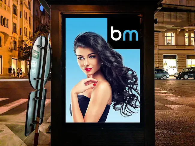
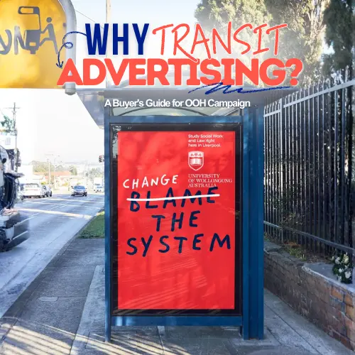
Craft emotive OOH that resonates
Explore high-visibility print and OOH formats that elevate brand values and recall.
Comments
Be the first to comment.