
Turning a Functional Change Into a Creative Story
Most packaging updates are communicated in a simple, practical way. Brands usually explain the improvement and move on. Chupa Chups takes a much smarter route.
Rather than saying the wrapper is now easier to open, the campaign focuses on the frustration people have felt for years. Opening a Chupa Chups has always been a small but familiar struggle, and the brand turns that truth into the center of the idea. The message is not just about convenience. It is about relief. It is about finally ending a fight that consumers know very well.
That makes the campaign more human, more entertaining, and far more memorable than a standard product announcement.
A Lucha Libre Concept With Real Cultural Weight
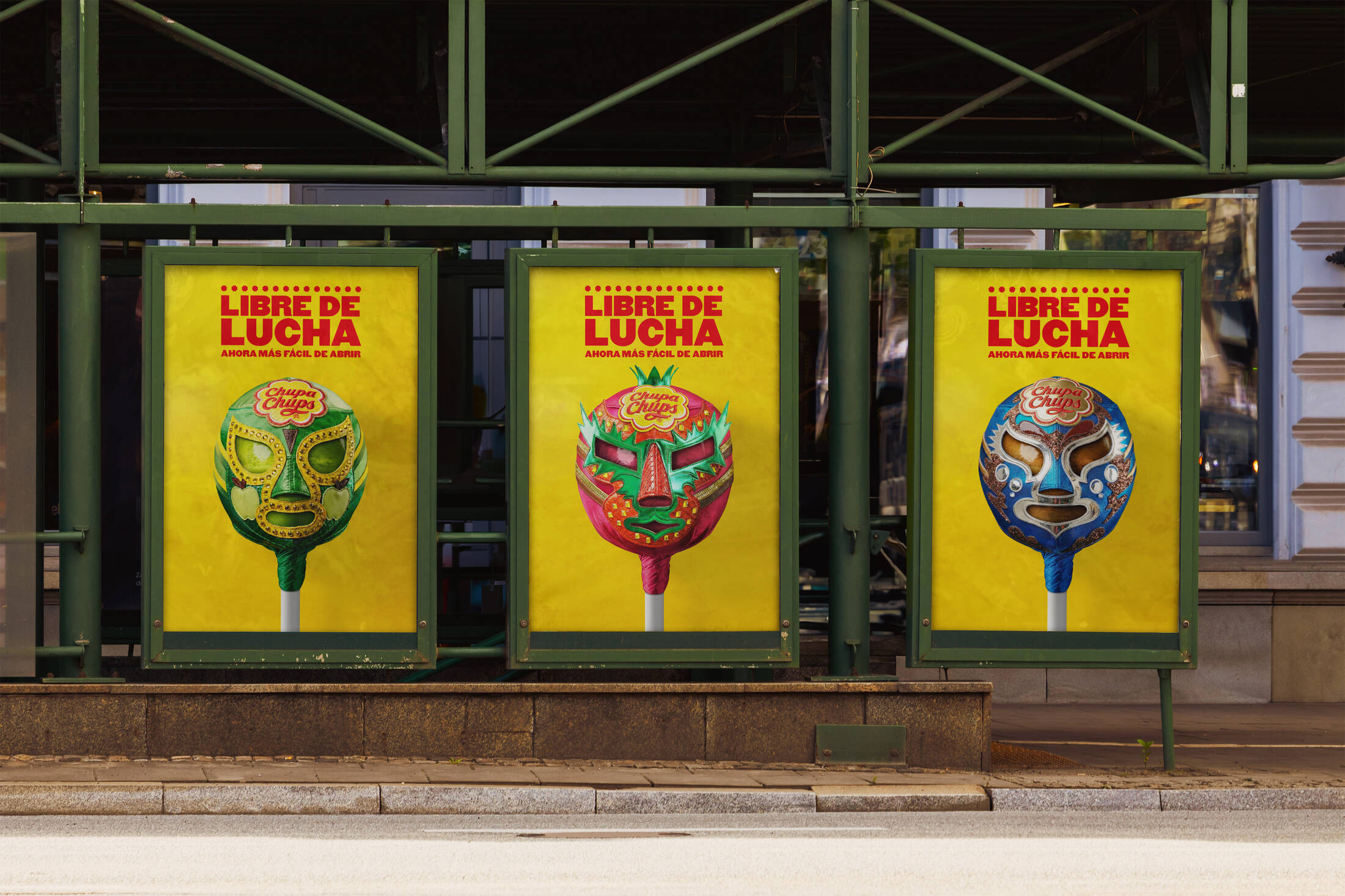
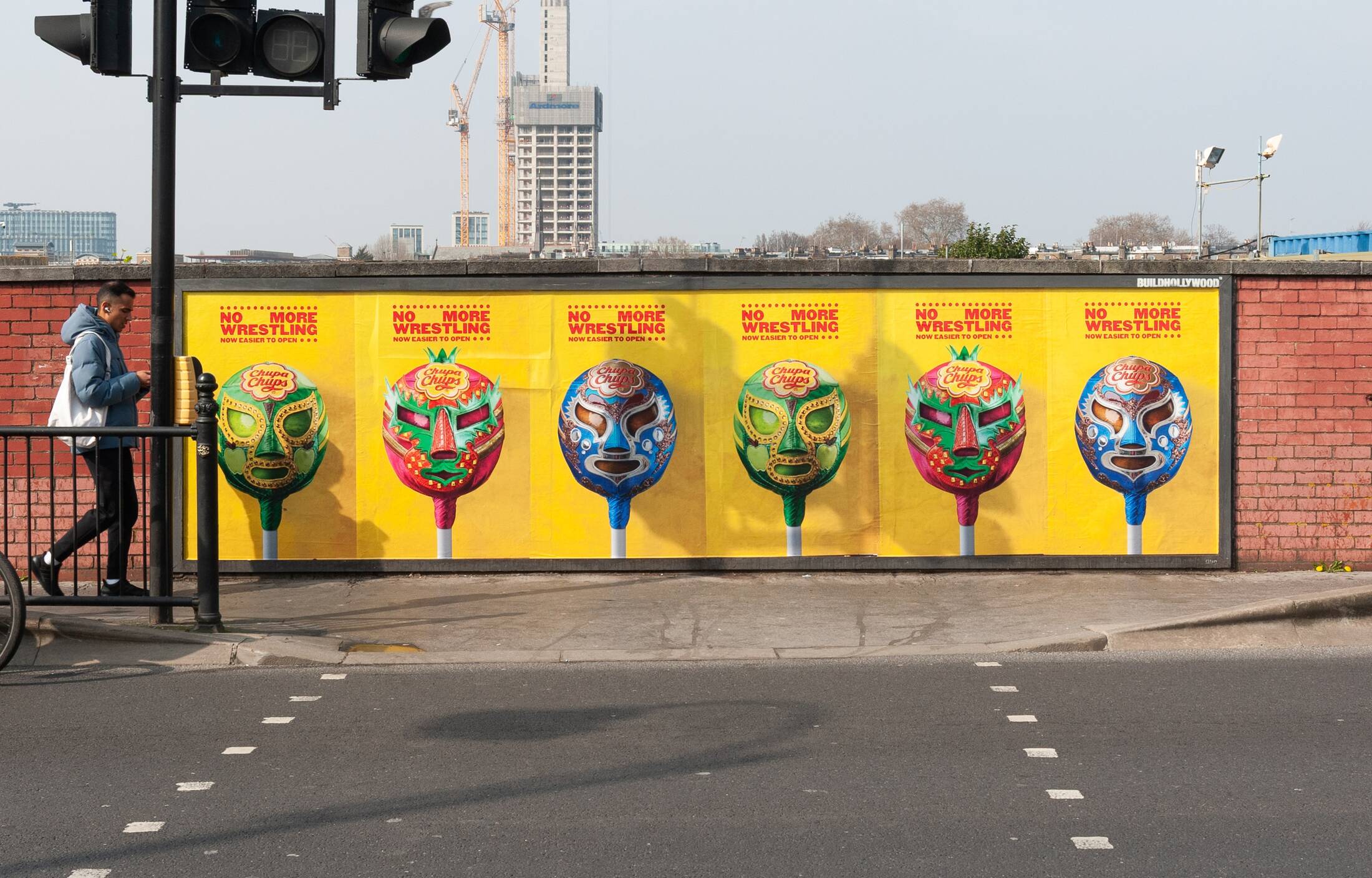
What gives the campaign real personality is its use of Mexican lucha libre. The idea of “wrestling” with the wrapper is brought to life through a series of masks inspired by classic wrestling culture. This makes the concept feel bold, visual, and emotionally charged from the first glance.
The masks were created in collaboration with renowned Mexican mask designer Arturo Bucio, whose long history of crafting masks for legendary wrestlers adds credibility and cultural depth to the execution. This detail matters because it keeps the campaign from feeling superficial. It is not just borrowing the style of lucha libre. It is engaging with it through a genuine craft tradition.
Each mask also reflects one of the product’s flavors, including Apple, Strawberry, and Cola. Elements from each wrapper were incorporated into the design so that every character feels distinct. That gives the campaign a collectible quality and helps transform packaging graphics into expressive brand assets.
Visual Design That Feels Native to the Street
The success of this campaign also comes from how well the design matches the medium. The headline “No More Wrestling” is inspired by classic Mexican wrestling fly posters, which gives the work a strong street-level attitude. The typography feels loud, immediate, and full of personality.
That choice is especially effective in OOH because it does not look like a generic ad placed outdoors. It looks like something that belongs in the urban environment. The campaign becomes more than a message on a poster. It becomes part of the visual culture of the street.
This is where the medium helps complete the idea. The use of flyposter locations supports the wrestling poster aesthetic and gives the creative a raw, authentic energy that a more polished or corporate format might have weakened.
Why the Campaign Works So Well
The campaign works because it takes a very small product truth and treats it with real imagination. Everyone understands the frustration behind the message, so the idea is immediately relatable. At the same time, the creative exaggeration makes it entertaining enough to earn attention.
It also benefits from having a clear visual symbol. The masks do more than decorate the posters. They act as the embodiment of the struggle itself. That gives the campaign a strong identity and makes it easy to remember.
Most importantly, the execution respects a simple rule of effective outdoor advertising: the idea must land quickly. “No More Wrestling” is easy to understand in seconds, but it still has enough craft and cultural texture to reward a longer look.
OOH That Amplifies Brand Personality
This campaign is a strong example of how OOH can do more than deliver awareness. It can also reinforce brand character. Chupa Chups comes across as playful, self-aware, and creatively confident. The brand acknowledges a long-standing consumer frustration, but instead of apologizing or overexplaining, it turns that truth into something fun and distinctive.
That approach gives the campaign charm. It feels less like a correction and more like a celebration. The packaging update becomes an event, and the audience is invited to enjoy the joke along with the brand.
Summary
Chupa Chups takes a functional product update and transforms it into a memorable outdoor campaign by tapping into a universal consumer frustration. The idea of “wrestling” with the wrapper becomes the creative core, brought to life through handcrafted lucha libre masks designed by Arturo Bucio.
The campaign’s visual language draws from classic Mexican wrestling posters, making it feel authentic and impactful in urban environments. Deployed across the UK and Spain, the use of flyposter placements reinforces the street-level aesthetic and amplifies the concept.
Sources
Frequently Asked Questions
The campaign turns the frustration of opening a Chupa Chups into a lucha libre-style “fight,” celebrating the new easy-to-open packaging.
It visually represents struggle in a bold and culturally rich way, making the message more engaging and memorable.
It was executed across outdoor media in the UK and Spain, supported by social media.
Its simple insight, strong visuals, and cultural relevance allow the message to be understood instantly in public spaces.
Even small product improvements can become powerful campaigns when framed through storytelling and cultural context.
Ready to advertise outdoors?
BM Outdoor plans, buys and prints OOH campaigns across all 50 states. Request a free quote with no commitment.


Comments
Be the first to comment.