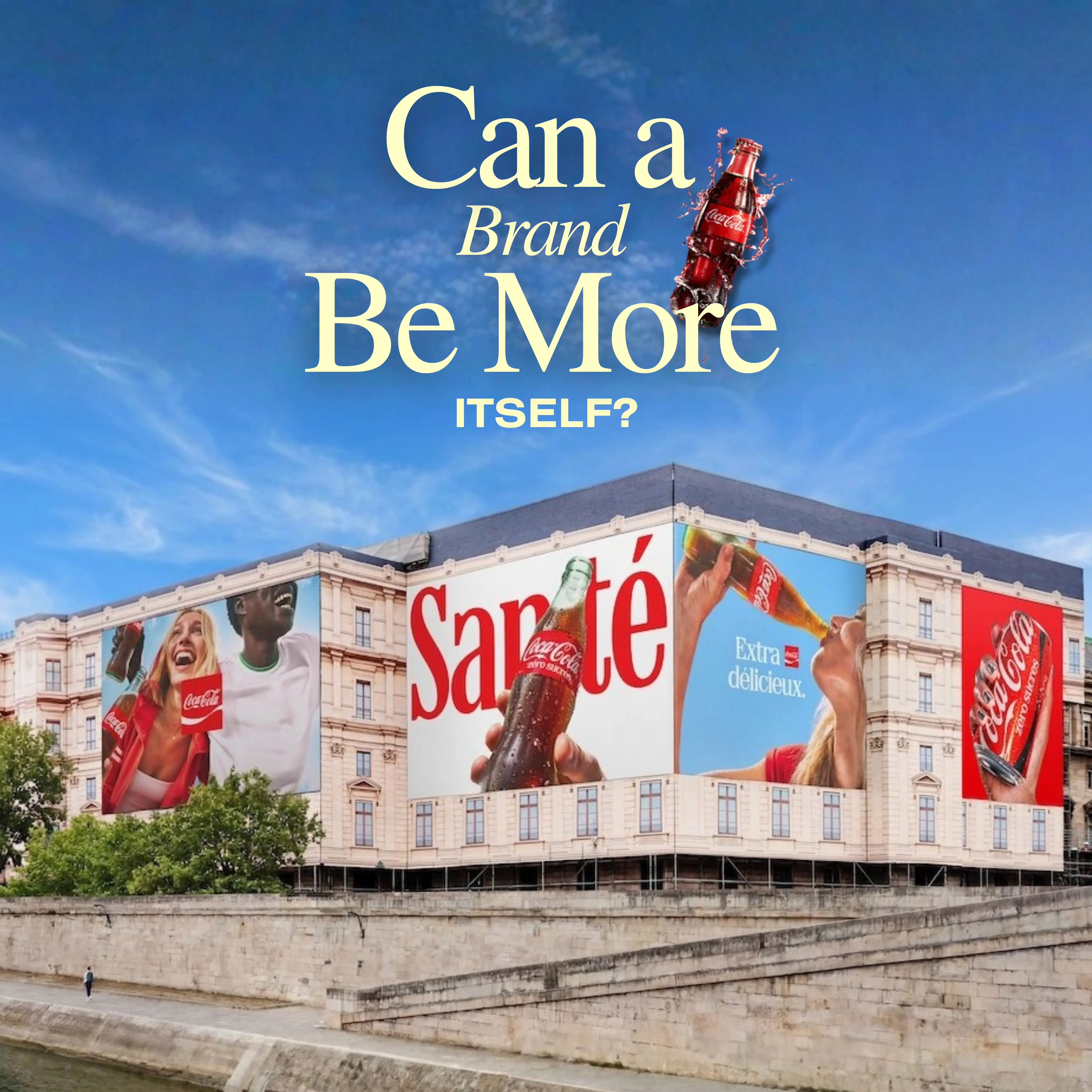
Making Coca-Cola More Coca-Cola
The Coca-Cola Company has introduced a refreshed global visual identity built around a simple idea: making the brand feel even more like Coca-Cola.
Rather than abandoning its heritage, the company is strengthening the visual elements that have made it recognizable for generations.

A Unified Look Across Global Markets
The new identity will appear across packaging, retail displays, vending equipment, and digital platforms in more than 200 markets.
The rollout has already begun in parts of Europe, the Middle East, and India, with Latin America and Asia expected to follow before the global launch continues through 2027.
Classic Brand Assets Take Center Stage
Coca-Cola’s familiar red-and-white palette remains at the heart of the system.
The refresh also gives greater prominence to the Dynamic Ribbon, the Arden Square, and the Spencerian Script logo.
Together, these elements create a more recognizable and consistent brand experience across every touchpoint.

Clearer Product Distinctions
The redesign also makes Coca-Cola’s product variants easier to identify.
Coca-Cola Zero Sugar will feature larger “Zero Sugar” lettering, a black Dynamic Ribbon on cans, and black bottle caps.
These details help consumers distinguish products quickly while preserving a cohesive family appearance.
Managing a Global Brand More Consistently
Behind the visual update, Coca-Cola has launched a new Brand Center and Design Intelligence tools for internal creative teams and agency partners.
These resources are designed to protect consistency as campaigns and packaging are adapted for markets around the world.

A Broad Creative Collaboration
JKR led the visual identity, while The Superultrarare worked on packaging systems and Brody Associates developed the typography.
Forpeople and Monks created the Brand Center, Adobe supported governance tools, and several photographers helped establish the updated image standards.

What Brands Can Learn
- Brand evolution does not always require a complete reinvention.
- Recognizable assets can become stronger through refinement.
- Clear product distinctions improve navigation for consumers.
- Consistency across markets strengthens global brand recognition.
- Internal design tools are essential for protecting identity at scale.
Final Reflection: Evolution Through Familiarity
Coca-Cola’s refresh shows how a global brand can modernize without losing the visual heritage that makes it distinctive.
By refining familiar elements instead of replacing them, the company is creating a stronger and more unified identity for the future.

Summary
Instead of replacing its iconic identity, Coca-Cola refined its red-and-white palette, Dynamic Ribbon, Arden Square, and Spencerian Script. The new system will roll out across more than 200 markets while making product variants easier to recognize.
Sources
FAQs
What changed in Coca-Cola’s visual identity?
The brand strengthened its red-and-white palette, Dynamic Ribbon, Arden Square, and Spencerian Script across global touchpoints.
Where will the new identity appear?
It will appear across packaging, retail displays, vending equipment, digital platforms, and campaigns in more than 200 markets.
How will Coca-Cola Zero Sugar look different?
It will use larger Zero Sugar lettering, a black Dynamic Ribbon on cans, and black bottle caps.
Which agency led the redesign?
Global branding agency JKR led the visual identity with support from several creative, design, photography, and technology partners.
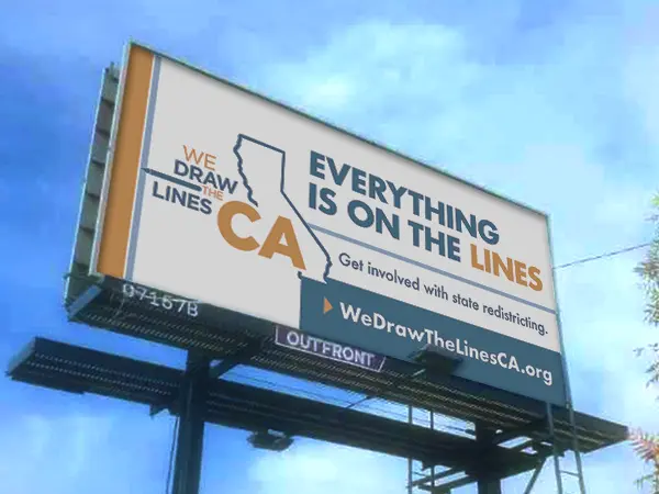
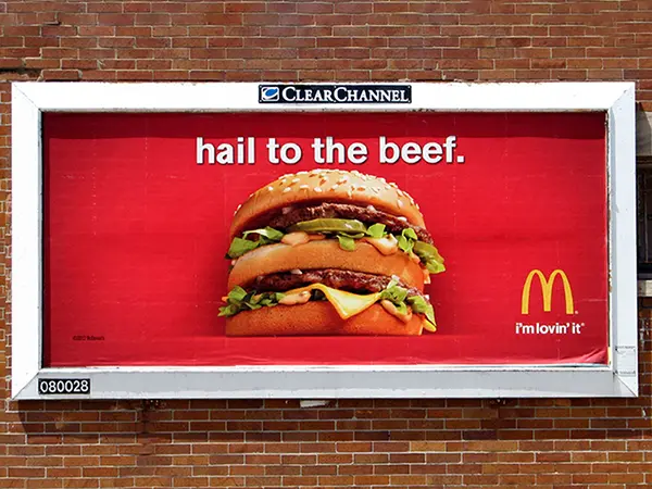
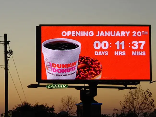
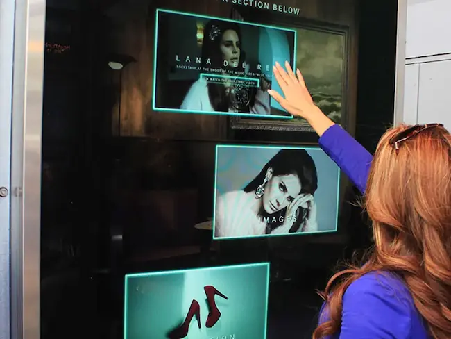
Ready to advertise outdoors?
BM Outdoor plans, buys and prints OOH campaigns across all 50 states. Request a free quote with no commitment.






Comments
Be the first to comment.