
KFC Rebuilds Its Global Brand System Around the Iconic Bucket in Major JKR Redesign
KFC has undergone a major global brand evolution developed with JKR, where the iconic bucket is no longer just packaging, but the central organising idea behind the entire system.
Instead of treating it as a container, the bucket becomes a framing device and storytelling tool that defines how the brand expresses itself across every touchpoint.
A Full 360 Brand Evolution
This is not a simple logo refresh. The work extends across packaging, restaurant environments, digital platforms, brand assets, and tone of voice.
JKR and KFC’s in-house teams have rebuilt the identity system to create a unified world rather than a standalone visual update.
The Logo Becomes More Dimensional
The Colonel is repositioned within the logo system, gaining more presence, clarity, and warmth while maintaining his recognisable character.
The result is a more expressive identity that feels both familiar and evolved.
From Stripes to Storytelling Asset
The iconic KFC stripes, previously used as a background texture, are reimagined as an active design and type-led system element.
This shift transforms a static brand pattern into a flexible storytelling device.
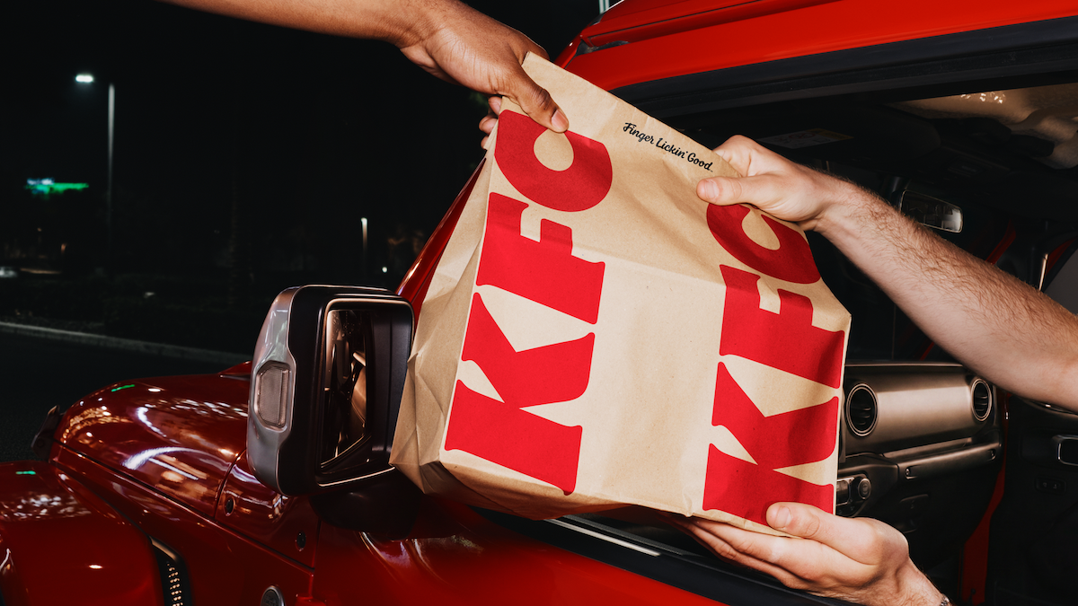
Finger Lickin’ Good Becomes a Brand Behaviour
Rather than functioning only as a tagline, “Finger Lickin’ Good” is repositioned as a global standard of behaviour.
It becomes a signal of quality and brand philosophy rather than a campaign sign-off.
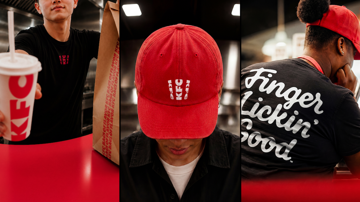
Custom Typography and Expanded Visual Language
Two bespoke typefaces, Kentucky Fried Serif and Kentucky Fried Sans, were developed in collaboration with StudioDRAMA, drawing inspiration from the brand’s original lettermark.
A refreshed colour system retains KFC’s signature red, white, and black while introducing a secondary “Herbs and Spices” palette inspired by the original recipe.
A System Built for Flexibility and Culture
The brand system also includes a heritage stamp language, motion design principles, illustration frameworks, and photography direction described as being shot “through a bucket lens.”
Artists and collaborators from Buenos Aires, Amsterdam, Xiamen, Lima, and Mumbai contributed to the expanded visual world.
What Brands Can Learn From This Campaign
KFC’s redesign shows how brands can scale identity systems by building everything around a single, powerful asset.
By turning the bucket into the foundation of the entire system, KFC demonstrates how consistency, storytelling, and flexibility can coexist within a modern global brand architecture.
Summary
JKR and KFC have developed a full global brand evolution that places the iconic bucket at the heart of the system.
Rather than a simple visual refresh, the redesign spans identity, packaging, environments, typography, tone of voice, and digital platforms, transforming the bucket into a unifying storytelling device for the entire brand world.
Frequently Asked Questions
The iconic KFC bucket becomes the organising idea for the entire global brand system.
The redesign spans logo evolution, typography, packaging, environments, and brand storytelling systems.
It is repositioned as a global brand behaviour and standard of quality rather than a simple tagline.
It demonstrates how a single iconic asset can be used to unify an entire global brand system across all touchpoints.
Ready to advertise outdoors?
BM Outdoor plans, buys and prints OOH campaigns across all 50 states. Request a free quote with no commitment.


Comments
Be the first to comment.