Tuzla, Istanbul turned a pedestrian crossing into a living accident chart. Each stripe of the crosswalk visualizes a decade of crashes in which pedestrians were injured or killed — part of a wider picture of 20,000+ incidents across Turkey. By merging data and design, a familiar street element became a life-saving reminder: Stop at the crosswalk, stop the accidents.
What’s the core idea behind this intervention?
Transform everyday infrastructure into data-driven communication. The crosswalk itself becomes the medium: every line, spacing, and count stands for real accident data, confronting drivers and pedestrians with the stakes of road safety at the very place where behavior must change.
How was the message brought to life?
Instead of ordinary white paint, the crossing was redesigned as a street-level infographic. The visual language is immediate and universal: no headlines needed. By embedding statistics into the flow of the city, the campaign interrupts routine and nudges compliance at the exact decision point.
Why does this campaign resonate with audiences?
Because it’s unexpected, useful, and human. Turning data into a tangible surface reframes safety rules from abstract advice into an urgent, shared responsibility. It shows how OOH thinking can extend beyond billboards to redesign public space for impact.
What’s the perspective behind this placement?
For municipalities and NGOs, safety messages often compete with visual clutter. By building the message into the ground, the intervention earns attention without adding another sign. It’s policy, design, and behavior change working together in the most visible, high-intent touchpoint.
How does this idea scale across channels?
The concept is modular and repeatable: adapt the graphic system to other crossings, pair with DOOH counters that update local stats, and extend to social with before/after footage and heatmaps. The more cities contribute their data, the more powerful the network effect.
Final thoughts: Can data and street design save lives?
This project proves how data visualization and urban design can turn a routine path into a force for prevention. It’s not just a warning — it’s a call to action for safer cities: respect the crosswalk, reduce collisions, and make the message impossible to miss.
FAQs about this campaign
What is the crosswalk campaign about?
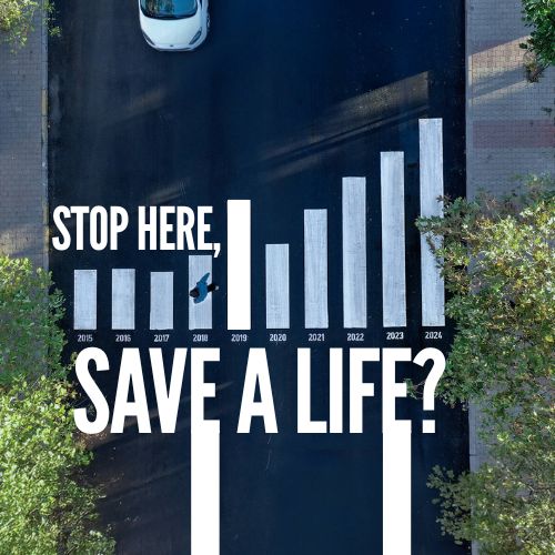
In Tuzla, Istanbul, a pedestrian crossing was redesigned as a living accident chart, with each stripe representing real crash data from the past decade.
Why does the idea resonate?
It’s unexpected and useful: the message is embedded in the ground where behavior changes—turning data into a tangible, life-saving reminder.
How does OOH thinking show up here?
Instead of adding another sign, the public space itself becomes the medium—an OOH principle applied to urban design for maximum relevance and recall.
Can this scale to other cities?
Yes. The visual system is modular: crossings can be adapted with local data, paired with DOOH counters, heatmaps, and social content for wider reach.
What can brands and cities learn?
That merging data visualization with place-based design can drive real behavior change—turning everyday infrastructure into persuasive communication.
Craft emotive OOH that resonates
Explore high-visibility print and OOH formats that elevate brand values and recall.
Comments
Be the first to comment.