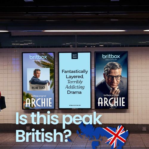
BritBox Unveils a Refined Brand Identity
BritBox has rolled out a refined brand identity created with creative company Sibling Rivalry—an update built to make the service feel clearer, more premium, and more consistent everywhere audiences encounter it. The key point is in the approach: this wasn’t a dramatic reinvention. BritBox asked for an evolution that respects the equity the brand has already built, while giving it a system strong enough to compete in an increasingly crowded streaming landscape.
Rather than starting from scratch, Sibling Rivalry audited years of organic growth and informal brand use, then translated those instincts into a coherent toolkit spanning visual identity, motion, tone of voice, and sonic branding. The result is a modular system that can flex across platforms and campaigns while still feeling unmistakably BritBox—modern, curated, and quietly confident.
Designed with restraint, not clichés
The refresh builds on BritBox’s broader brand direction, including the “See It Differently” campaign launched in spring 2025. That platform pushes back on British stereotypes, reframing “British” from a place into a perspective—one defined by wit, charm, and nuance rather than predictable visual tropes.
That thinking carries into the design decisions. The identity deliberately avoids the obvious shortcuts associated with “Britishness,” stepping away from the stereotypical red-and-blue, Union Jack-coded look. In its place is a simplified, single-color mark paired with an expanded typography and color palette. It’s a subtle shift, but an important one: BritBox now looks less like a themed channel and more like a premium specialty streamer with a point of view.
The “box” becomes the brand’s signature device
The smartest choice in the system is how BritBox treats its most ownable asset: the “box.” Instead of functioning only as a logo container, the box becomes a framing device that runs through the entire brand—almost like a quiet curator. It frames characters, moments, and key UI elements, creating a consistent visual structure across marketing, promotions, and product experiences.
This matters because streaming brands don’t live in one place. They live across thumbnails, endboards, social cuts, platform UI, and campaigns that rotate constantly. A flexible framing device allows BritBox to unify that sprawl without forcing every piece into the same template. Even when the logo isn’t visible, the box can carry recognition.
BritBox also introduced new layout structures called “macro moments,” designed to reflect how British storytelling often blends character and place. These layouts use the box icon like a portal into the story, paired with macro textures that anchor the setting—helping each title feel distinct while still belonging to the same brand world.
A sonic identity that matches the visual confidence
The refresh isn’t only visual. BritBox now has a sonic mnemonic created with composer Joel Pickard: short, memorable, lightly melodic, and designed to feel warm and confidently British without leaning into parody or pastiche. Just like the visual system, the sound aims to be refined rather than loud.
What makes it more effective is that sound and motion were developed together. The box device’s movement synchronizes with the mnemonic, creating a consistent audio-visual signature that can be applied across idents, promo endboards, and product moments. That’s how brands build recognition today—not through one logo, but through repeated, coherent cues across the entire consumer journey.
The takeaway for streaming brands
BritBox’s refresh is a strong example of what modern brand evolution should look like: keep what works, clarify what’s distinctive, and build a system that scales. In a market where every platform is fighting for attention, cohesion is a competitive advantage—and BritBox’s new identity is designed to deliver exactly that.
Summary
BritBox’s refresh builds on its “See It Differently” direction, positioning British entertainment as a perspective rather than a stereotype. Sibling Rivalry simplified the logo into a single-color mark, expanded typography and color tools, and centered the system on the “box” as a quiet curator across marketing and product. New “macro moments” layouts pair character framing with texture to connect story and place. A new sonic mnemonic—developed with composer Joel Pickard—syncs with motion principles so the brand sounds as consistent as it looks, creating a cohesive experience across the consumer journey.
Sources
Frequently Asked Questions
BritBox evolved its brand with a refined visual system, updated logo, expanded typography and color tools, and a cohesive motion and sonic toolkit—designed for clarity and premium perception.
The new brand identity was developed in partnership with creative company Sibling Rivalry, building on BritBox’s existing equity rather than reinventing the brand.
The “box” is a framing device that acts as a signature brand element across marketing and product UI—highlighting characters and moments even when the logo isn’t shown.
Ready to advertise outdoors?
BM Outdoor plans, buys and prints OOH campaigns across all 50 states. Request a free quote with no commitment.


Comments
Be the first to comment.