GIO Reinvents Insurance Confidence With “Great Insurance, Obviously” Campaign
GIO has launched a bold new brand campaign with Leo Australia designed to reassure Australians that when life throws curveballs, they can count on insurance that truly protects them. Titled “Great Insurance, Obviously,” the campaign taps into a powerful cultural insight: Australians want clarity, confidence, and emotional reassurance from their insurance provider — especially in uncertain times.
By introducing a playful yet meaningful visual metaphor, GIO transforms the idea of protection into something instantly recognizable and emotionally relatable.
A Simple Insight: Australians Crave Confidence in Insurance
In today’s unpredictable environment, consumers increasingly seek stability and trust from essential services. Insurance, in particular, carries emotional weight — people want to feel safe, prepared, and supported when unexpected events happen.
The campaign responds directly to this mindset by positioning GIO as a brand that delivers certainty without complexity. Instead of relying on traditional insurance clichés or technical language, the creative focuses on a universal symbol of safety: a soft landing.
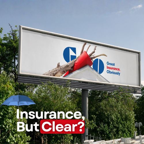
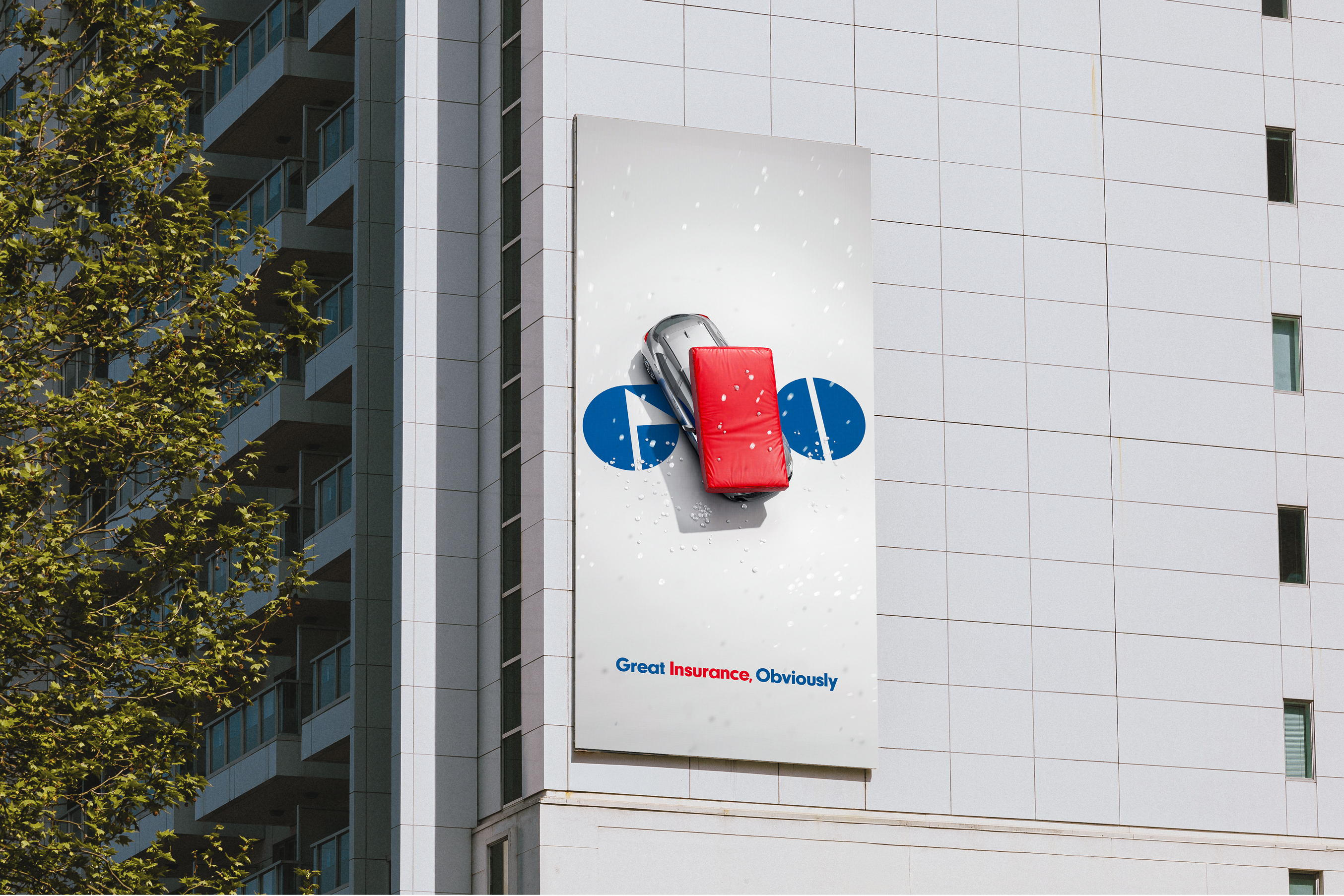
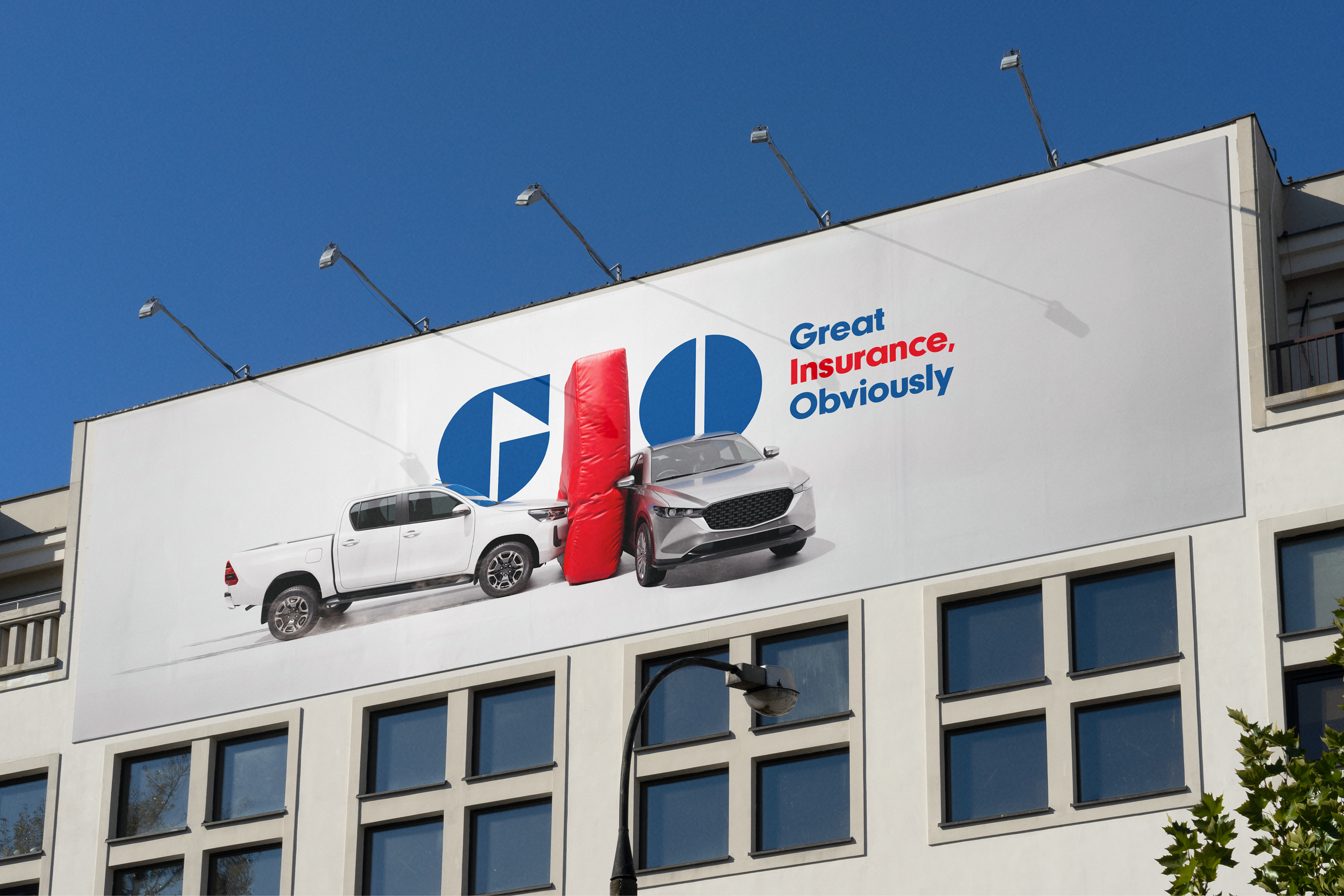
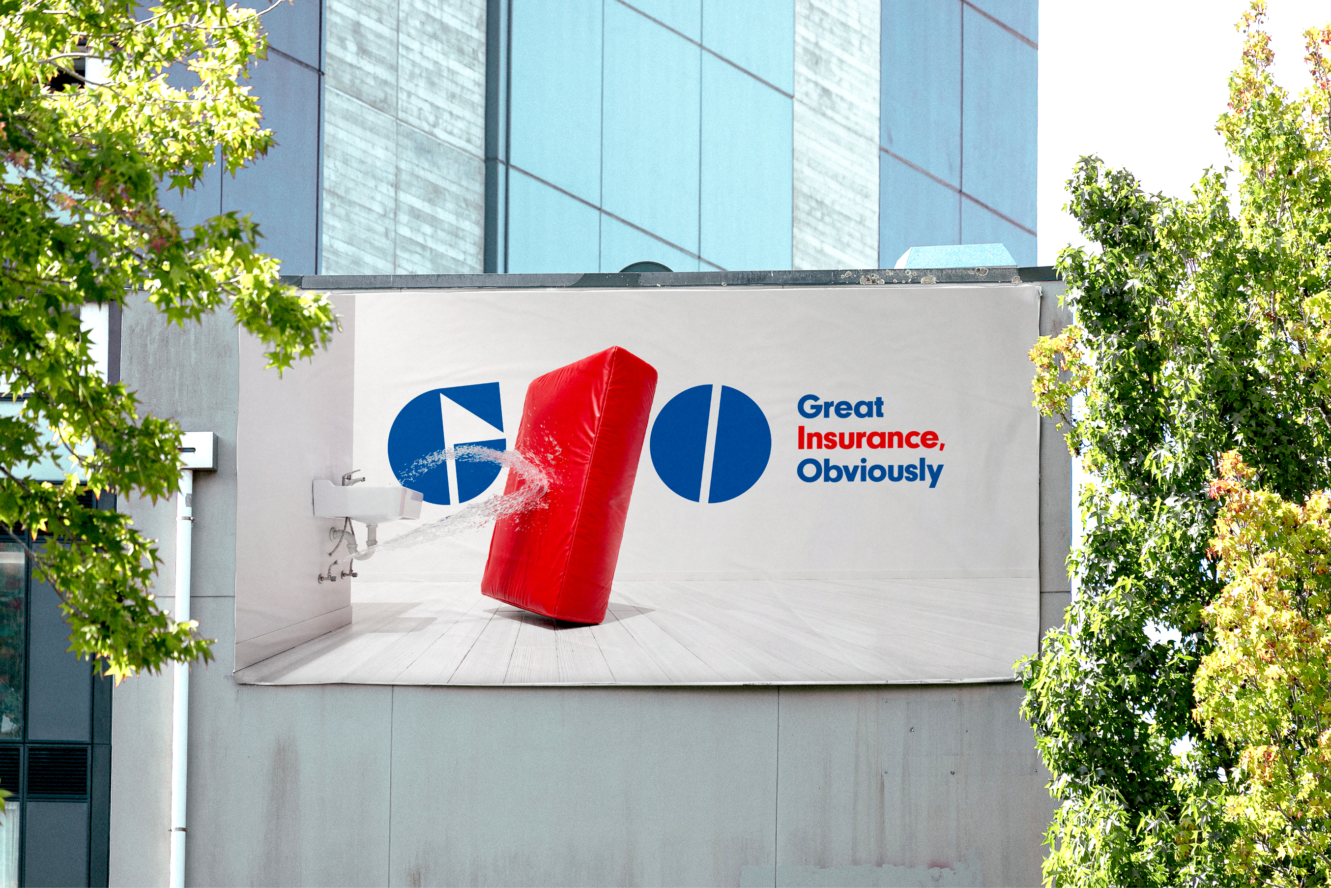
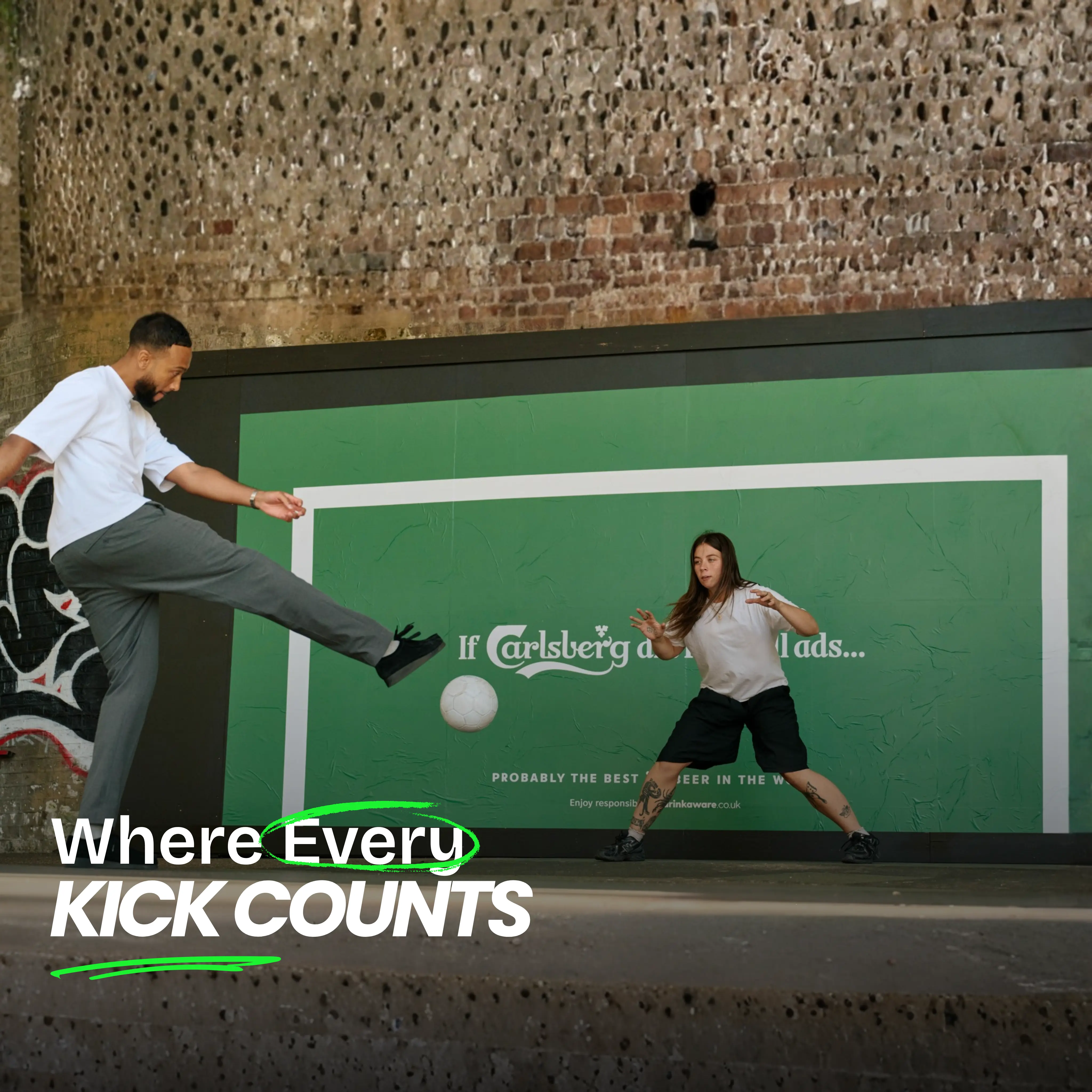
The Safety Mat Becomes a Brand Icon
At the heart of the campaign is a clever visual transformation. The letter “I” in GIO morphs into a safety mat, turning a single typographic element into a powerful symbol of protection, cushioning life’s inevitable falls.
The safety mat represents reassurance, reliability, and readiness — qualities that consumers instinctively associate with protection. This visual device allows the brand to communicate its promise instantly, even in fast-moving environments like outdoor advertising and high-traffic media placements.
The simplicity of the idea makes it highly scalable across formats, from large-format billboards to digital screens, social content, and broadcast placements.
Breaking Away From Traditional Insurance Advertising
Rather than leaning into dramatic or overly emotional insurance tropes, Leo Australia deliberately adopted a more subversive, comedic tone. The campaign treats everyday mishaps with lightness and relatability, helping the brand feel more human and approachable.
Executive Creative Director Tim Woolford explained that the goal was to reconnect Australians with what GIO truly represents: safety, dependability, and great insurance — without taking itself too seriously.
This balance between emotional reassurance and playful storytelling strengthens memorability and brand warmth.
Strengthening Brand Trust Through Visual Storytelling
Mim Haysom, EGM Brand and Customer Experience at Suncorp Group, highlighted that GIO has spent over a century building trust as an iconic NSW brand. The campaign refreshes that legacy by modernizing the brand voice while maintaining credibility.
By transforming a logo element into a storytelling device, the campaign creates a distinctive brand asset that can live across all touchpoints — reinforcing recognition and consistency at scale.
Summary
GIO’s latest campaign reassures Australians that reliable insurance offers confidence in uncertain times.
The creative transforms the “I” in the GIO logo into a safety mat symbolizing protection and soft landings.
The campaign avoids traditional insurance clichés in favor of playful, emotionally engaging storytelling.
Developed by Leo Australia, the idea modernizes the brand while reinforcing trust and reliability.
Its simplicity makes it highly effective across out-of-home and integrated media channels.
Sources
Frequently Asked Questions
The campaign reassures Australians that GIO provides reliable protection when life throws unexpected challenges. It positions the brand as a dependable safety net through a simple and emotionally engaging visual metaphor.
The safety mat represents protection, reassurance, and a soft landing when things go wrong. By transforming the “I” in the GIO logo into a safety mat, the campaign turns a single letter into a powerful and instantly recognizable brand symbol.
The campaign was developed by Leo Australia in collaboration with GIO and Suncorp Group’s brand team, bringing together strategic insight, playful creativity, and strong brand storytelling.
Ready to advertise outdoors?
BM Outdoor plans, buys and prints OOH campaigns across all 50 states. Request a free quote with no commitment.


Comments
Be the first to comment.