
A Rebrand Rooted in Purpose
Larkin Street Youth Services, the largest provider supporting young people experiencing homelessness in San Francisco, has undergone its first major brand redesign in over 40 years. With a legacy of helping more than 80,000 young people, the organization needed an identity that reflected both its scale and its leadership within the nonprofit sector.
To achieve this, Turner Duckworth partnered with the organization in a pro-bono project, bringing world-class design thinking into a space that rarely benefits from it.
The Challenge: Bridging Two Audiences
At the heart of the project was a complex design challenge. The new identity needed to resonate with high-net-worth donors while remaining accessible, authentic, and meaningful to the young people the organization serves.
This duality required a careful balance. On one side, the brand needed to convey credibility, trust, and institutional strength. On the other, it had to feel welcoming, human, and real—never distant or overly corporate.
The Open-Door Concept
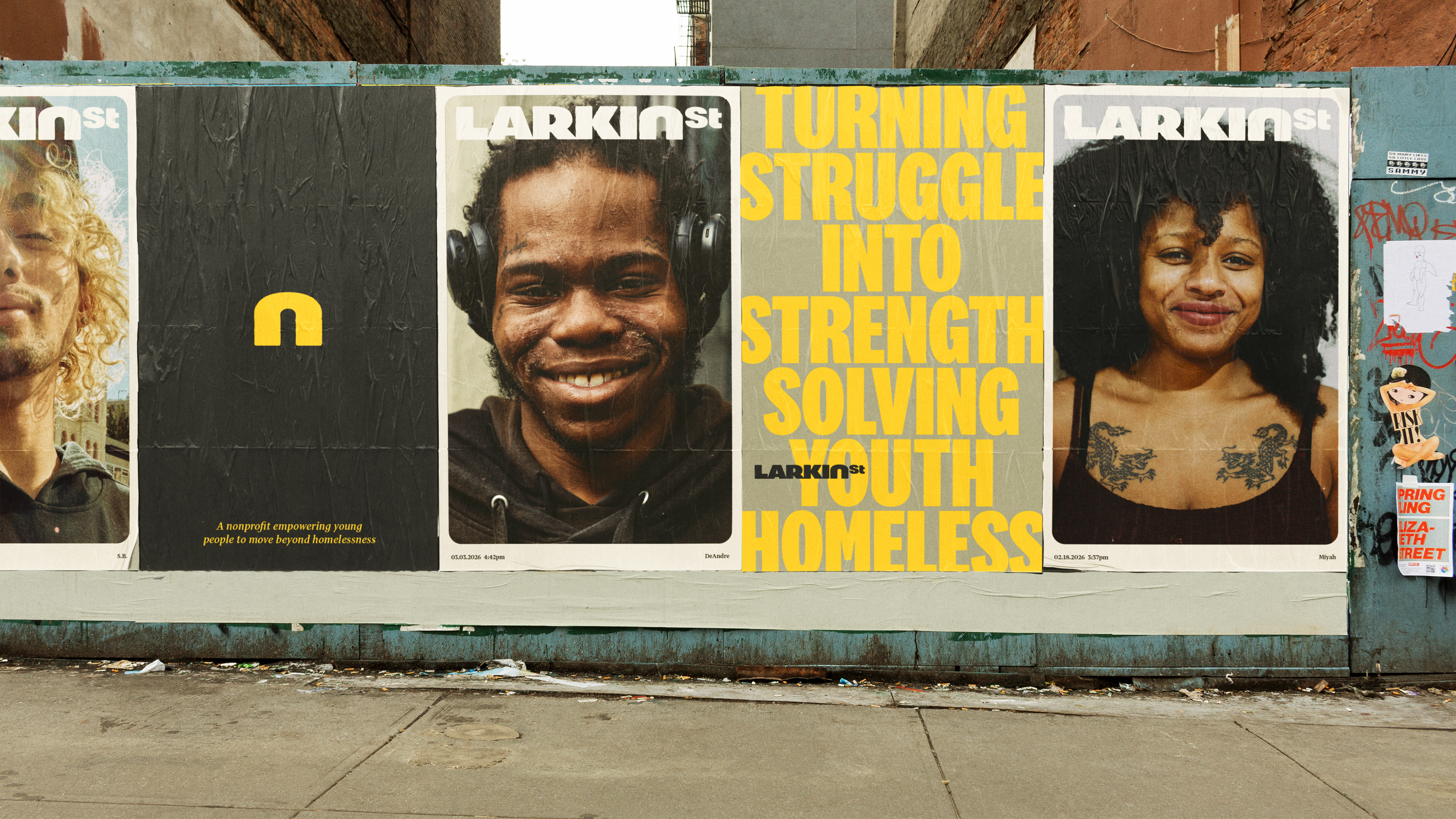
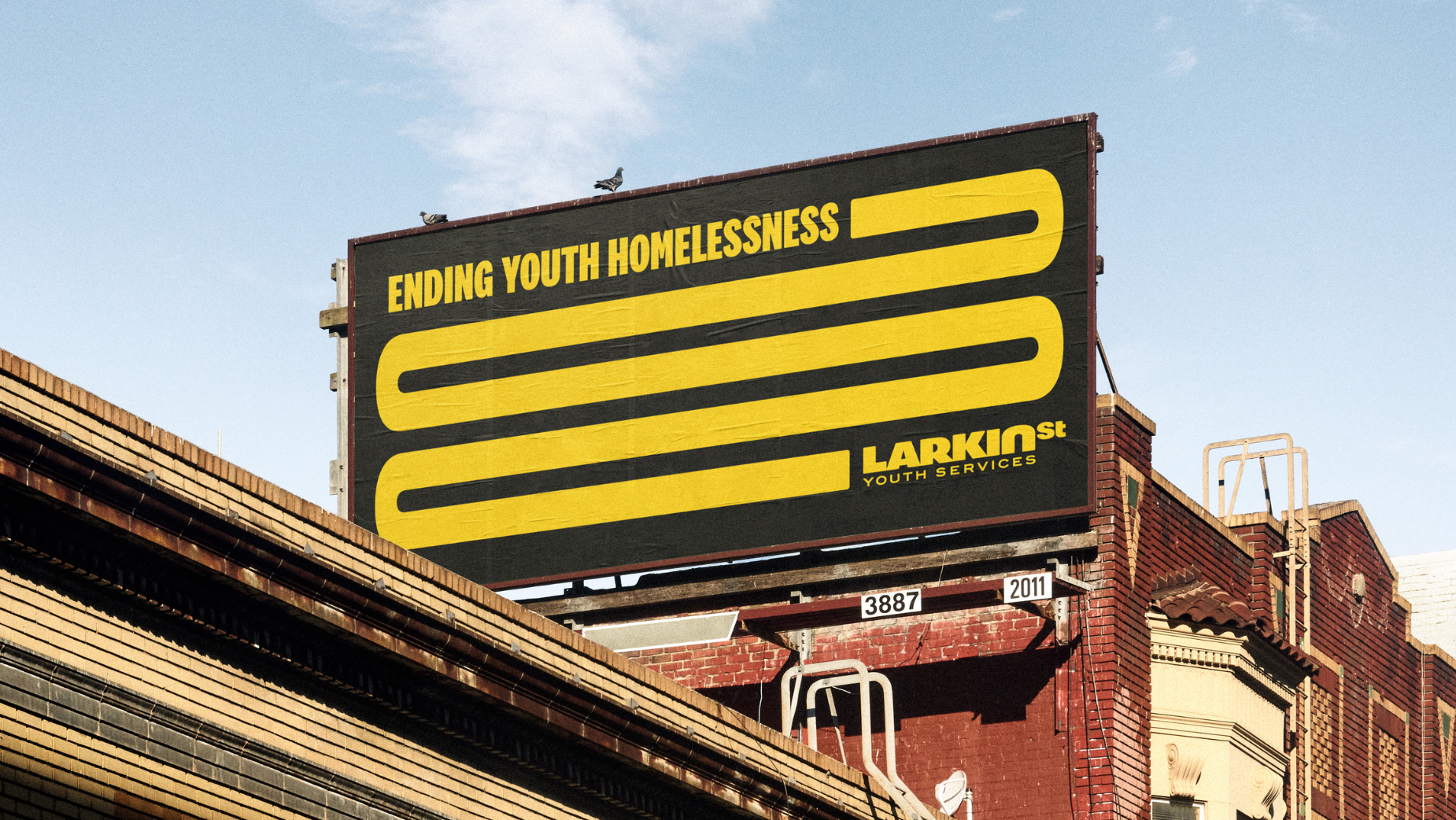
The solution came in the form of a powerful and symbolic idea: the open door.
Integrated directly into the wordmark, the open-door symbol represents access, safety, and opportunity. It reflects the organization’s promise to every young person who walks through its doors—a chance for a new beginning.
At the same time, the symbol communicates transparency and trust to donors, acting as a visual bridge between two very different audiences. It is simple, but deeply intentional.
A Visual Identity That Builds Trust
The new identity system elevates the organization’s presence while maintaining emotional warmth. It introduces a more refined and cohesive visual language, allowing Larkin Street Youth Services to stand confidently alongside larger institutions and national organizations.
Yet, it avoids feeling exclusive. The tone remains open and inclusive, ensuring that the people it serves still see themselves reflected in the brand.
Why This Rebrand Matters
This project highlights an important shift in how nonprofit organizations approach branding. Design is no longer just about aesthetics; it is a strategic tool for impact.
By working with Turner Duckworth, Larkin Street Youth Services demonstrates that nonprofits deserve the same level of design excellence as global brands. Strong branding can build trust, attract funding, and ultimately expand impact.
A Lesson for Brands and Nonprofits
The Larkin Street rebrand proves that the most effective identities are those that balance clarity with emotion. It shows that a single, well-executed idea—in this case, an open door—can communicate complex values in a simple and memorable way.
More importantly, it reinforces that design can act as a bridge. Not just between audiences, but between perception and reality, helping organizations align how they look with the impact they truly have.
Summary
Larkin Street Youth Services, the largest provider for young people experiencing homelessness in San Francisco, underwent its first major rebrand in over 40 years.
The project, delivered pro bono by Turner Duckworth, addressed the challenge of connecting with both high-net-worth donors and the youth it serves.
At the center of the new identity is an open-door symbol that communicates welcome, transition, and opportunity.
The visual system balances institutional credibility with emotional warmth and authenticity.
The result is a modern identity that reflects the organization’s scale, impact, and leadership in the nonprofit sector.
Frequently Asked Questions
The identity is built around an open-door concept that symbolizes access, safety, and new beginnings.
The rebrand was developed pro bono by Turner Duckworth.
After decades of impact, Larkin Street Youth Services needed a visual identity that matched its scale and national recognition.
It successfully bridges the gap between appealing to major donors and remaining relatable to the youth it supports.
It represents opportunity, inclusion, and the first step toward a better future.
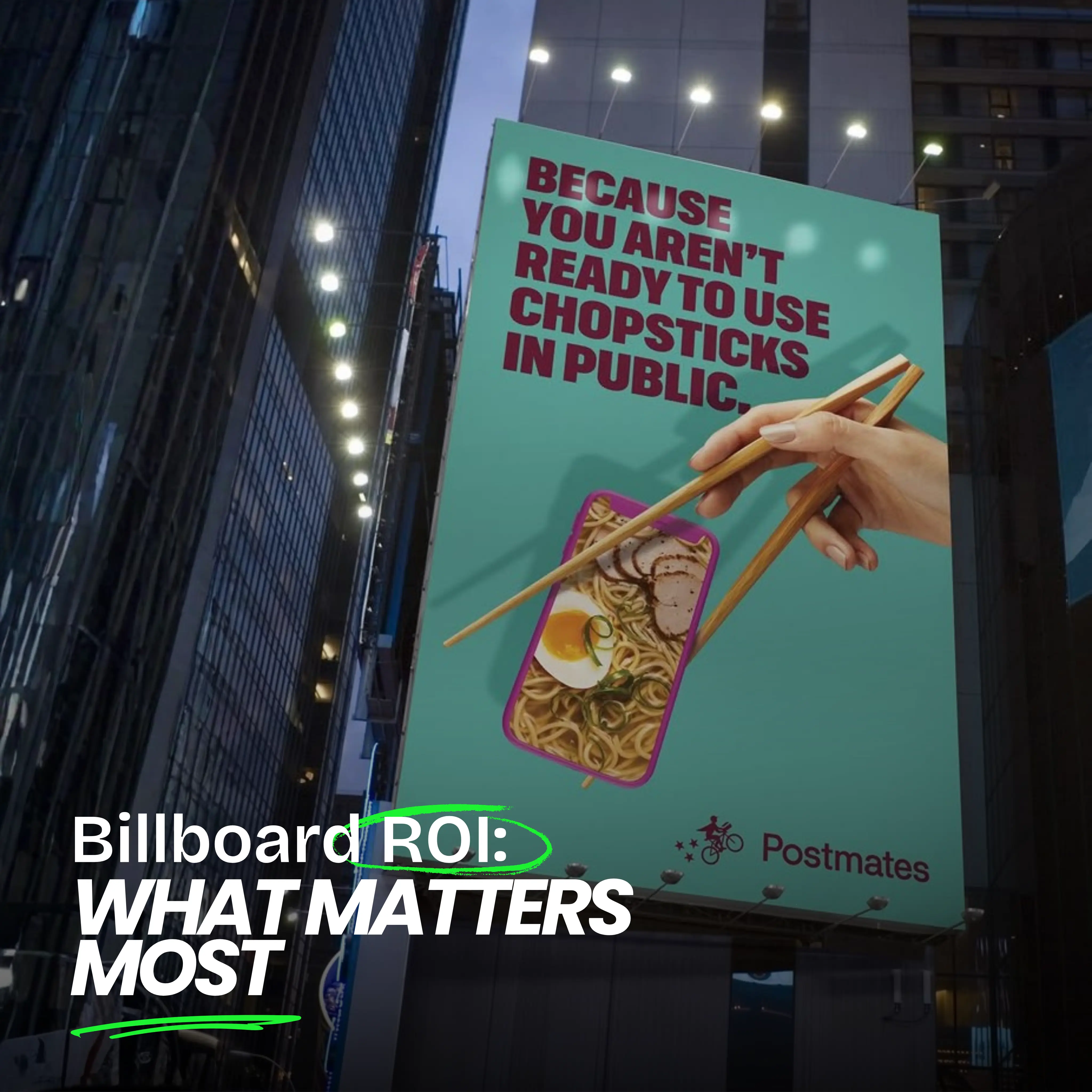
Ready to advertise outdoors?
BM Outdoor plans, buys and prints OOH campaigns across all 50 states. Request a free quote with no commitment.


Comments
Be the first to comment.