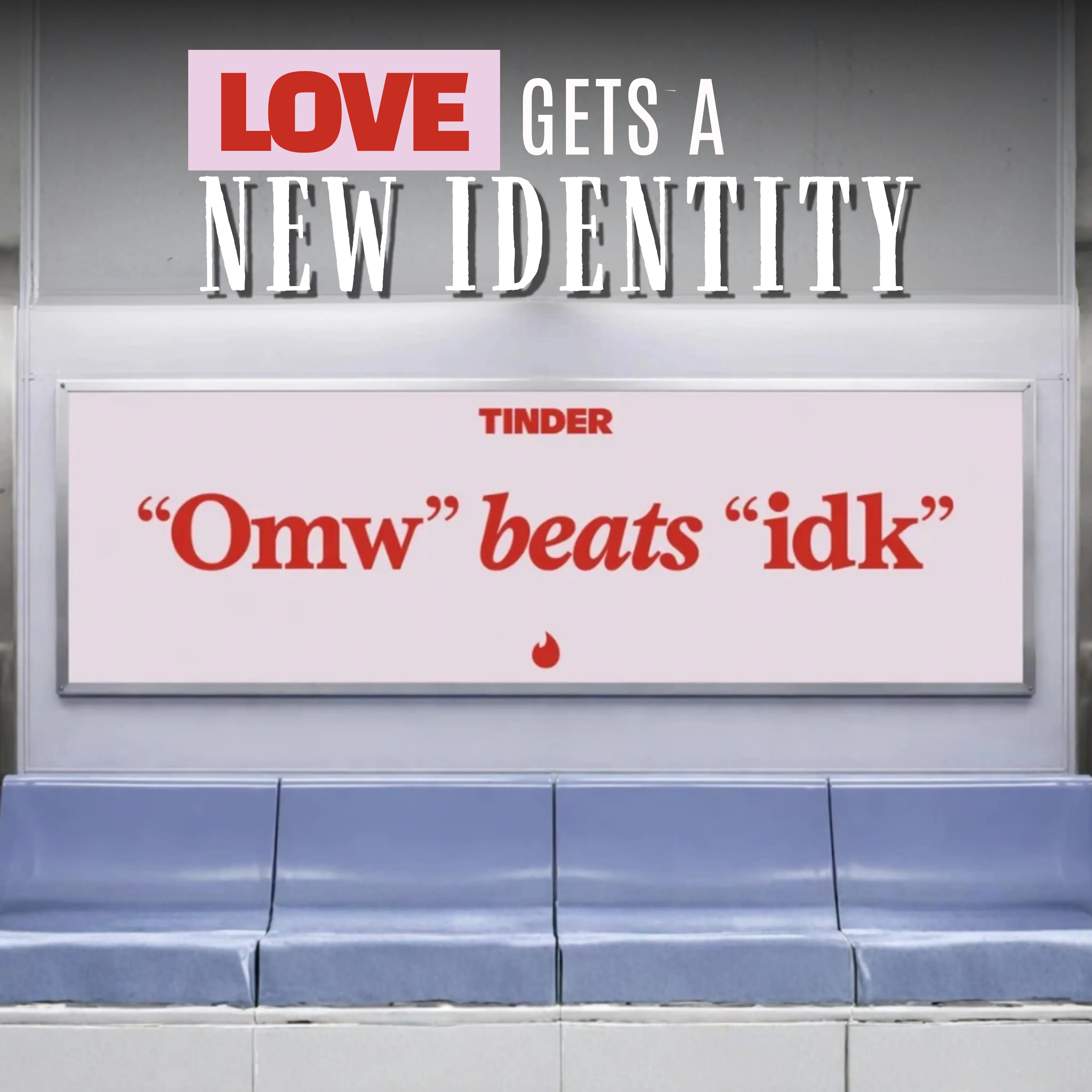
Quick insight: Tinder isn't just changing how it looks—it's redefining how it talks about dating. The platform's first major rebrand in nearly a decade embraces the complexity, humor, and spontaneity of modern relationships.
A Brand Built For Modern Dating
Created with creative agency Porto Rocha, Tinder's refreshed identity reflects how dating has changed for a generation that values exploration, authenticity, and flexibility.
The new look introduces a sharper flame icon, an all-caps wordmark, expressive serif typography, and an expanded palette that blends reds, pinks, blues, and greens to represent the emotional spectrum of dating today.
Rather than simply modernizing its appearance, Tinder repositions its entire personality.
Meet "T"
At the center of the rebrand is "T", a fictional voice inspired by iconic relationship columnists.
Confident, witty, and self-aware, T replaces traditional dating clichés with messaging that feels more honest and culturally relevant.
Lines like "Date around and find out," "Happily TBD," and "Anyone can happen" encourage users to embrace every kind of relationship—not just the search for "the one."
A More Expressive Visual World
The art direction expands beyond portraits of couples, mixing candid photography with internet culture, pop references, fine art, and playful visual metaphors.
Even classic dating symbols like hearts, roses, and Cupid's arrow receive a glossy, translucent redesign that feels contemporary while remaining instantly recognizable.
The result is a visual language that feels dynamic, optimistic, and unmistakably Gen Z.
Swipe Becomes A Design Language
One of the most recognizable interactions in digital culture—the swipe—is no longer just a gesture inside the app.
Tinder transforms it into a motion design system that reveals typography, photography, and graphic elements throughout the brand experience.
The animation captures the anticipation, excitement, and endless possibilities that define modern dating.

Why This Rebrand Works
- Updates an iconic brand without losing recognition.
- Creates a distinctive personality through a unique brand voice.
- Reflects cultural shifts instead of following design trends.
- Builds consistency across digital, social, and marketing channels.
- Transforms product interactions into brand storytelling.
Key Takeaways For Marketers
- A successful rebrand goes beyond a new logo.
- Voice can become as recognizable as visual identity.
- Motion design strengthens brand consistency.
- Modern audiences respond to authenticity over perfection.
- Brands grow by evolving with culture—not chasing it.

Final Thought
Tinder's new identity reflects a broader shift in branding, where personality, storytelling, and flexibility matter just as much as visual design.
By redefining how it speaks about relationships, the platform positions itself not simply as a dating app, but as a brand that understands how connection has evolved for a new generation.
Frequently Asked Questions
The company wanted to better connect with a new generation of users whose views on dating, relationships, and identity have evolved over the past decade.
The rebrand was created in partnership with the creative agency Porto Rocha.
Tinder updated its flame icon, typography, color palette, voice, photography style, illustrations, and motion design system.
T is Tinder's new fictional brand voice, inspired by advice columnists and created to deliver honest, witty, and self-aware messaging.
The identity celebrates the many ways people connect today, moving beyond the traditional idea of finding a single lifelong partner.
Ready to advertise outdoors?
BM Outdoor plans, buys and prints OOH campaigns across all 50 states. Request a free quote with no commitment.
















Comments
Be the first to comment.