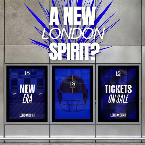
A modern identity built on tradition
Marylebone Cricket Club (MCC) has officially unveiled a refreshed visual identity for London Spirit, its team competing in The Hundred, ahead of the 2026 cricket season. The rebrand was developed by creative agency of record VCCP, with branding and design led by SomeOne, following new investment from US-based tech group Tech Titans.
Rather than distancing itself from tradition, the new identity strengthens London Spirit’s connection to Lord’s Cricket Ground, positioning heritage as a core asset rather than a limitation.
Unity as the strategic foundation
At the heart of the rebrand is a clear strategic idea: unity. VCCP worked closely with MCC to define a brand platform that brings together multiple dimensions of the club’s identity.
The refresh celebrates the unity between Lord’s historic legacy and the modern format of The Hundred, the men’s and women’s teams under a “one club, two teams” philosophy, and the diverse generations of fans that attend matches. It also reinforces the relationship between Lord’s and London itself, grounding the team firmly within the city’s cultural fabric.
Modernizing icons without losing provenance
Visually, the new branding draws heavily from traditional MCC and Lord’s symbols, reinterpreting them through a contemporary design lens. Classic icons are simplified, modernized, and integrated across the identity system to feel relevant to today’s audiences while retaining their historical significance.
The result is a confident, expressive brand that respects cricket’s past while embracing its future—designed to resonate with long-time supporters and new fans alike.
Why this rebrand matters
As The Hundred continues to redefine how cricket is consumed and experienced, teams like London Spirit must communicate accessibility, inclusivity, and relevance. This rebrand demonstrates how legacy institutions can evolve without erasing their DNA, using design and strategy to bridge generations and expand the sport’s appeal.
Summary
London Spirit’s refreshed brand identity reflects a strategic shift toward unity across generations, teams, and tradition. Led by VCCP with design by SomeOne, the rebrand modernizes MCC and Lord’s iconic symbols while staying rooted in cricket heritage. The new look positions London Spirit as a cultural bridge between historic sport and contemporary audiences ahead of the 2026 season.
Sources
Frequently Asked Questions
London Spirit’s new brand identity is a refreshed visual system developed for the 2026 season that blends Marylebone Cricket Club’s historic heritage with a modern, inclusive design aligned with The Hundred competition.
The rebrand strategy was led by creative agency VCCP, with branding and design developed by SomeOne, in close collaboration with Marylebone Cricket Club.
The update aims to better represent unity—between men’s and women’s teams, tradition and modernity, generations of fans, and the connection between Lord’s Cricket Ground and the city of London.
Ready to advertise outdoors?
BM Outdoor plans, buys and prints OOH campaigns across all 50 states. Request a free quote with no commitment.


Comments
Be the first to comment.