Frequently Asked Questions
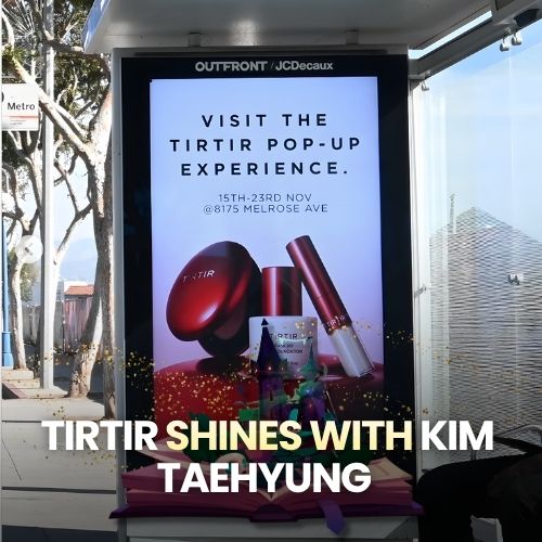
It features a massive billboard starring Tae, using bold red tones and editorial photography to create an unforgettable K-beauty presence in the city.
A fan shared a photo captioned ‘every view is just insane,’ highlighting the installation’s striking aesthetics, which quickly spread across social media.
Below the billboard, TIRTIR’s store mirrors the same red, glossy visual identity, creating a seamless exterior-to-interior brand experience.
Although not part of the campaign, the clock added symmetry and a cinematic frame that elevated the overall composition of the viral image.
That bold aesthetics, cultural relevance, and fan-driven amplification can turn an OOH execution into a powerful urban and social media moment.
Ready to advertise outdoors?
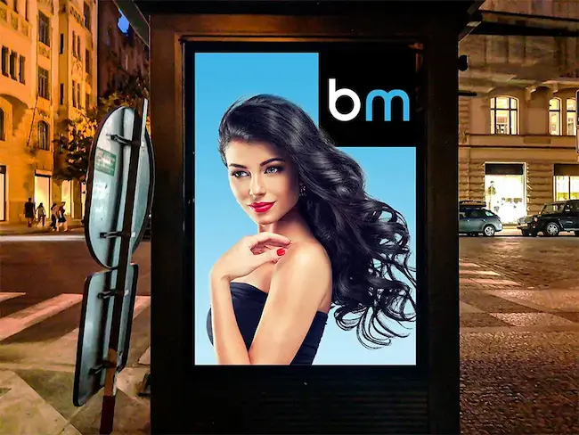
BM Outdoor plans, buys and prints OOH campaigns across all 50 states. Request a free quote with no commitment.


Comments
Be the first to comment.