
KitKat’s OOH Campaign Turns Everyday Dashes Into a Reason to Take a Break
KitKat has built one of the most recognizable brand platforms in advertising with the phrase “Have a break.” In its latest out-of-home campaign, the brand finds a fresh way to express that idea by turning a simple dash into a visual reminder of pause, transition, and interruption.
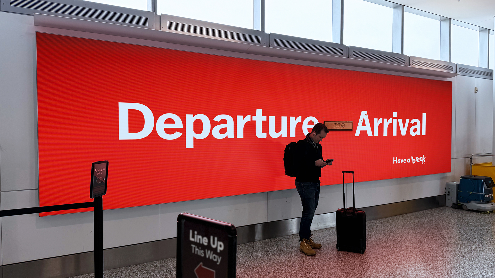
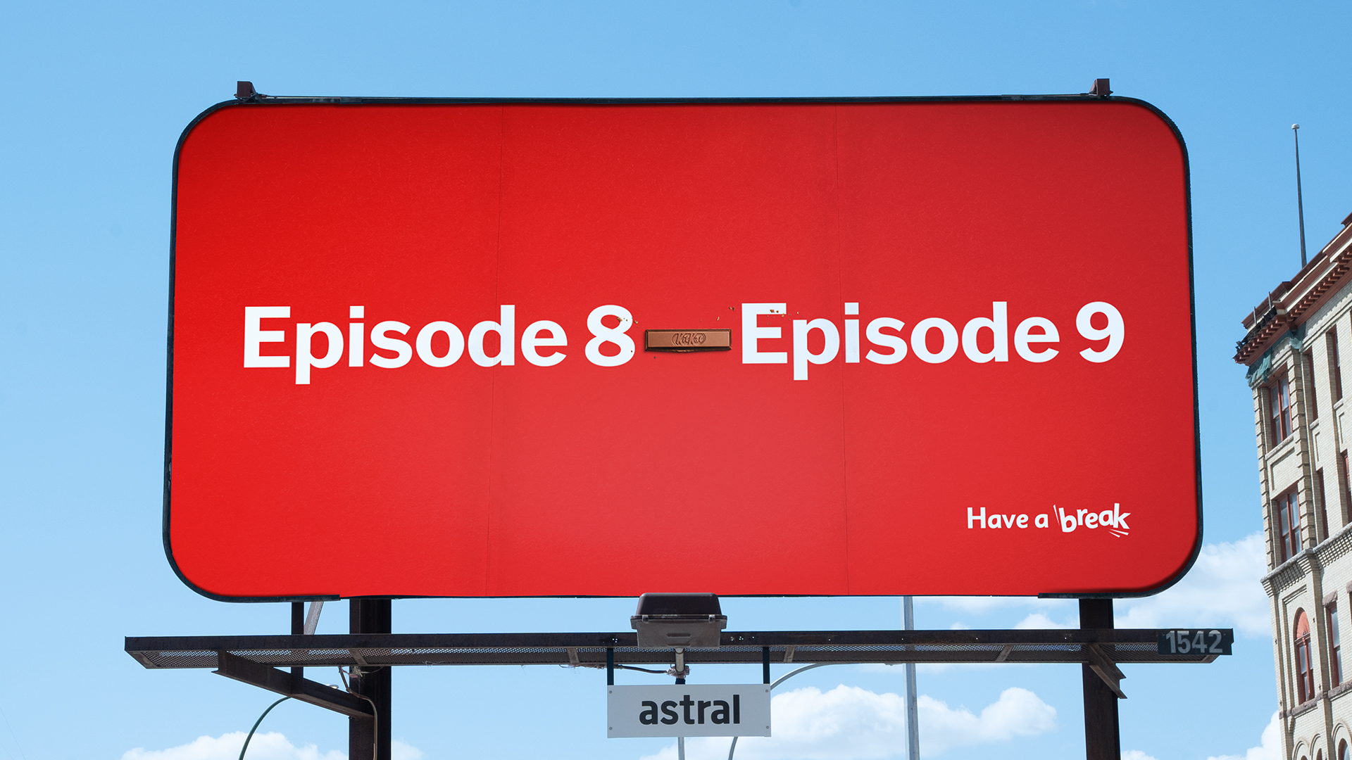
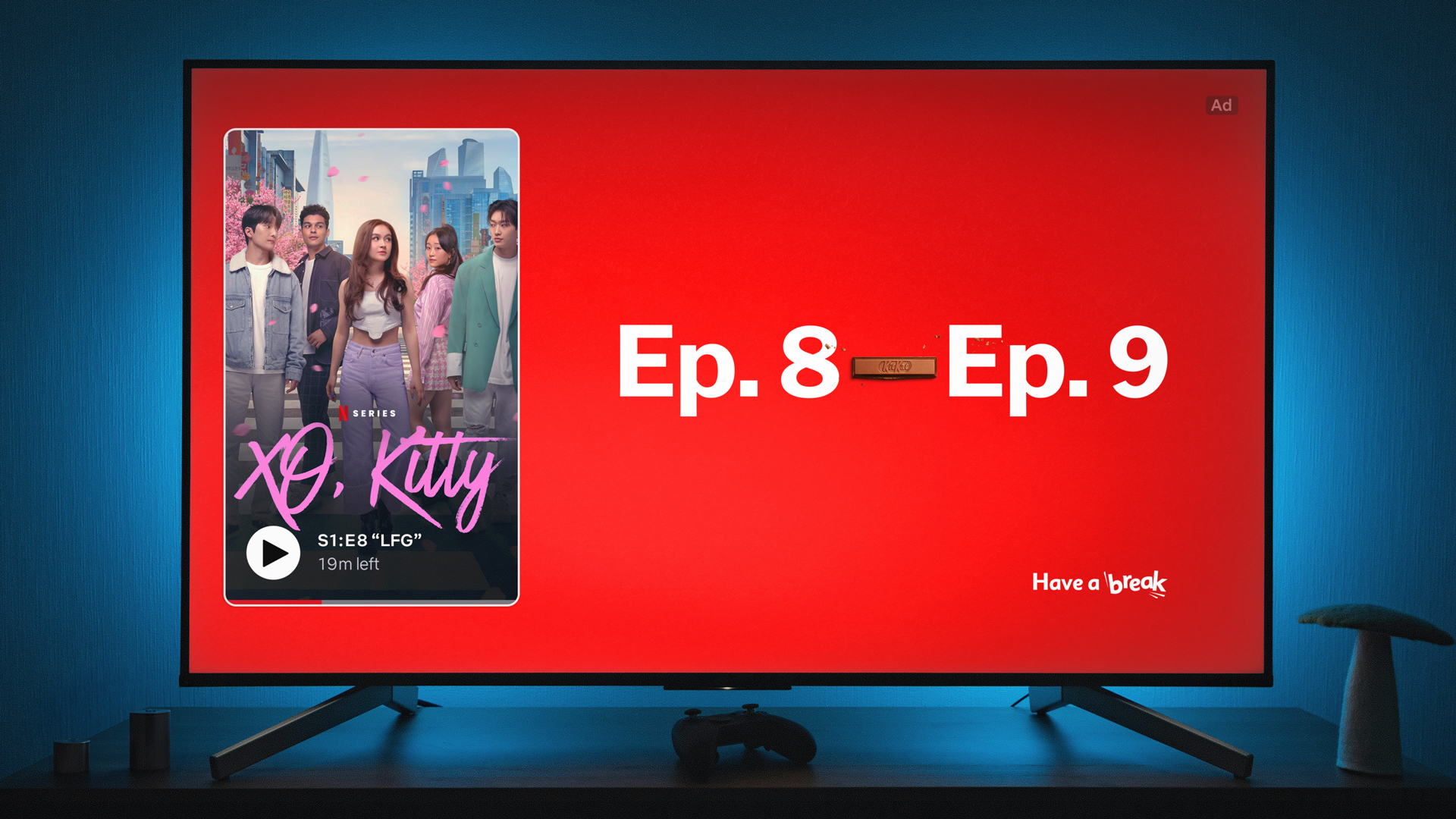
Created by Courage for Nestlé Canada, the campaign replaces the dash in everyday ranges and sequences with a segment shaped like a KitKat bar. Whether the reference is “9-5,” “Ep.8-Ep.9,” “7th inning-8th inning,” or “YYZ-JFK,” the message is the same: the space between two things can also be a break.
How KitKat Turns a Dash Into a Brand Idea
The brilliance of the campaign lies in how little it needs to do. A dash is already a familiar symbol people see all the time in schedules, travel routes, episode progressions, and sporting moments. By substituting that mark with a KitKat bar segment, the brand transforms punctuation into a visual asset.
That makes the idea feel immediate. Once the viewer notices the replacement, the connection becomes hard to ignore. The dash no longer looks neutral. It starts to feel like what KitKat wants it to represent: a small but meaningful pause.
Why This OOH Campaign Works So Well
This campaign succeeds because it is both minimal and highly strategic. It does not rely on a complex message, a crowded layout, or heavy explanation. Instead, it uses negative space, typography, and one iconic product shape to communicate the entire concept.
That simplicity gives the campaign strong out-of-home value. People can understand it quickly while passing by, but the idea also rewards a second look. It is clever without becoming confusing, which is one of the hardest balances to achieve in billboard advertising.
A Smart Use of Everyday Context in Advertising
One of the strongest elements in the campaign is its use of familiar contexts. Work hours, flights, sporting events, and streaming sessions are all moments people instantly recognize. By inserting the KitKat bar into those patterns, the brand places itself inside ordinary routines rather than outside them.
This makes the campaign feel culturally aware and behavior-driven. Instead of telling people to take a break in an abstract way, it shows that breaks already exist between the activities that structure everyday life.
Typography, Minimalism, and Brand Recognition
Visually, the campaign is stripped down to the essentials. A bright red background, bold white lettering, and the unmistakable shape of a KitKat bar are enough to deliver the message. That restraint is part of what makes the execution powerful.
KitKat’s visual identity is already strong enough that even minimal compositions remain instantly recognizable. The campaign proves that when a brand owns its colors, shape, and tagline, it can say more with less.
Why the Dash Becomes the Perfect Symbol for a Break
The dash represents a transition. It sits between one thing and another, often unnoticed, quietly linking moments together. That makes it an ideal symbol for KitKat, a brand that has always positioned itself around the value of stepping back, pausing, and resetting.
By reframing the dash as a KitKat bar, the campaign turns a common punctuation mark into something emotional and branded. It becomes more than typography. It becomes a reminder that even the smallest pause can matter.
Final Take on KitKat’s Dash OOH Campaign
KitKat’s new OOH campaign shows how a tiny visual intervention can unlock a powerful creative idea. By finding the brand inside a symbol people already encounter every day, Courage gives “Have a break” a fresh and contemporary expression.
It is a strong example of how smart creative can come from observation, restraint, and a deep understanding of what the brand already owns.
Summary
KitKat’s new out-of-home campaign builds on the brand’s long-running “Have a break” platform by focusing on one overlooked symbol: the dash. Created by Courage for Nestlé Canada, the campaign swaps dashes in familiar time ranges and sequences for KitKat bar segments, making the idea of a break feel hidden in plain sight. Executions reference work hours, travel routes, sports, and streaming behavior, showing how breaks exist between the moments people move through every day. The concept is simple, highly recognizable, and tightly connected to KitKat’s core brand meaning.
Sources
Frequently Asked Questions
The campaign turns dashes in everyday expressions into KitKat bar segments, reframing them as visual symbols of a break.
The work was created by Courage for KitKat / Nestlé Canada.
It uses a tiny, familiar punctuation mark and gives it instant brand meaning, which makes the idea simple, memorable, and easy to spot. This is an interpretation based on the campaign descriptions and visuals.
The examples include work hours, flights, sports innings, and episode ranges, showing breaks between everyday moments.
The work ties back to KitKat’s iconic “Have a break” positioning.
Ready to advertise outdoors?
BM Outdoor plans, buys and prints OOH campaigns across all 50 states. Request a free quote with no commitment.


Comments
Be the first to comment.