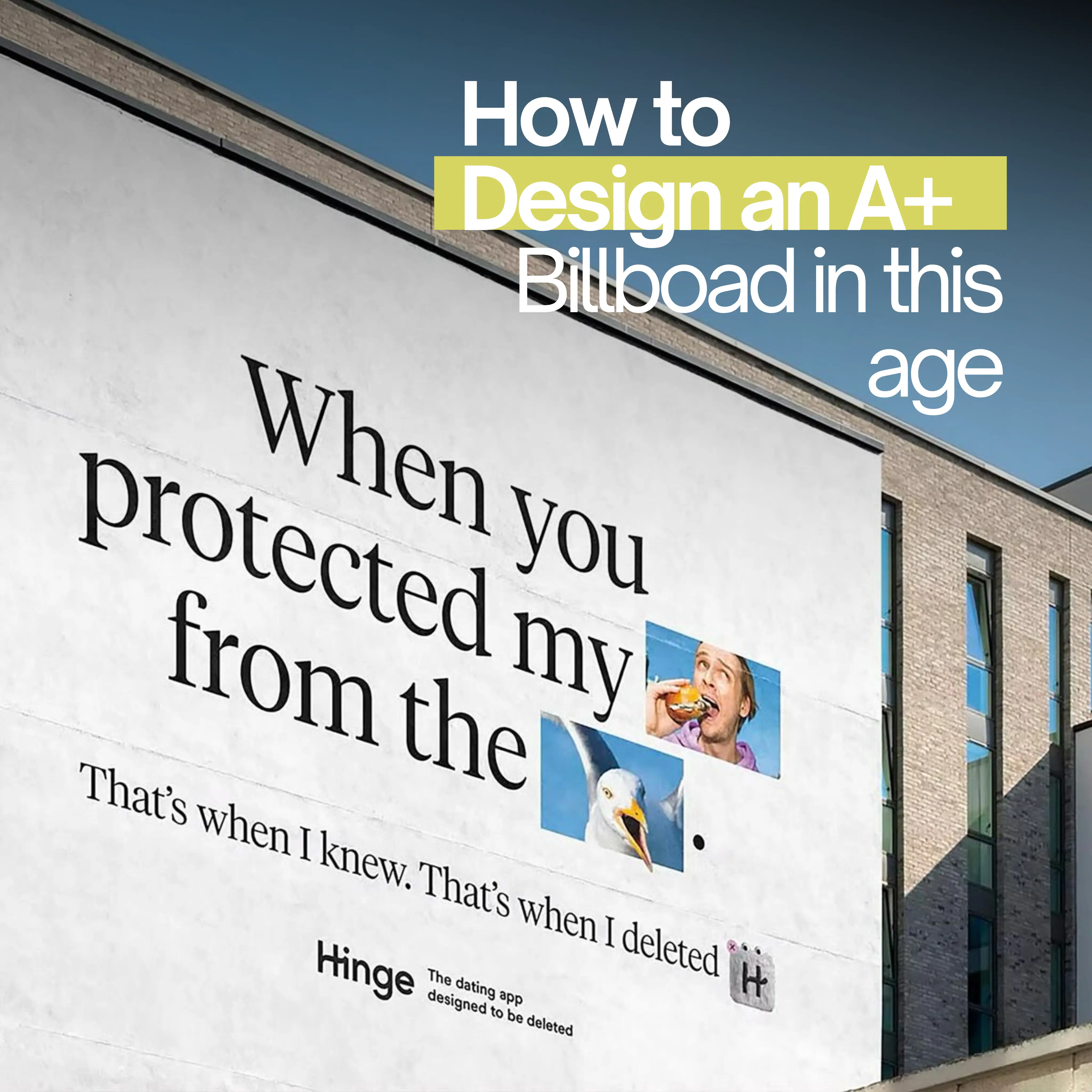
Quick Answer: A strong billboard design communicates one idea fast. Use a short headline, high contrast, large type, a clear logo, one visual focus, and one action. If the audience cannot understand it in a few seconds, the design is doing too much.
Billboard Creative Is Not a Print Ad
A billboard is seen in motion, at distance, and often with distractions. That makes it different from a website, brochure, social post, or magazine ad. The audience does not choose to spend time with it. The design has to earn comprehension immediately.
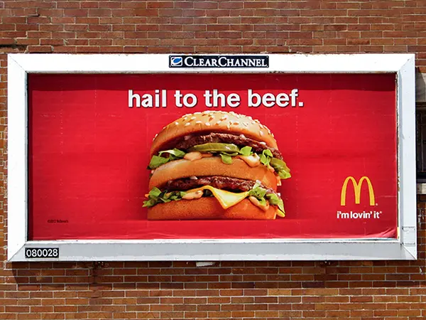
Good billboard design is disciplined. It removes information until the core idea is unmistakable. The best creative is not always the cleverest layout. It is the one people can read, remember, and act on.
The Practical Billboard Design Checklist
| Element | Best Practice | Common Mistake |
|---|---|---|
| Headline | One short thought | Multiple claims or a long sentence |
| Image | One dominant visual | Collage, busy background, too many products |
| Logo | Clear and large enough to recognize | Small logo hidden in a corner |
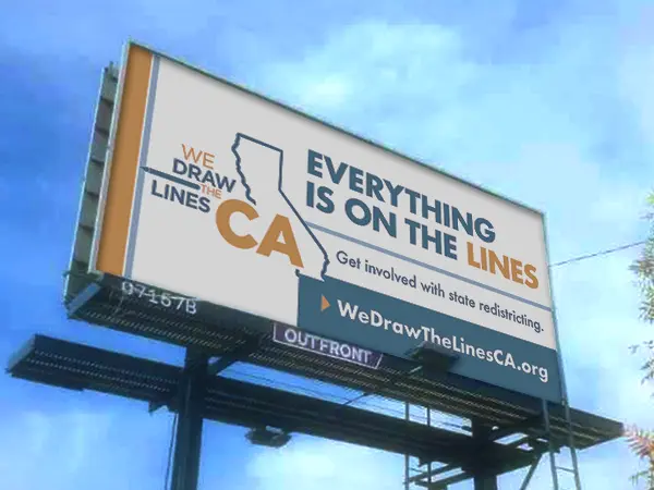
| Contrast | Strong foreground/background separation | Low contrast colors or thin type |
| CTA | Simple action: search, call, visit, exit, tour | Long URL, social handles, multiple actions |
| Proofing | Test at distance and speed | Approving only on a large desktop screen |
Use One Idea
The most important rule is one idea per board. If the campaign needs to communicate price, offer, product, location, phone number, website, QR code, social handle, and brand story, the billboard will fail. Choose the idea that matters most for the campaign stage.
A new restaurant may need "Now open." A real estate development may need "Model homes open." A healthcare clinic may need "Urgent care nearby." A national brand may need a memorable visual and name. Trying to say everything makes the board weaker.
Build a Clear Visual Hierarchy
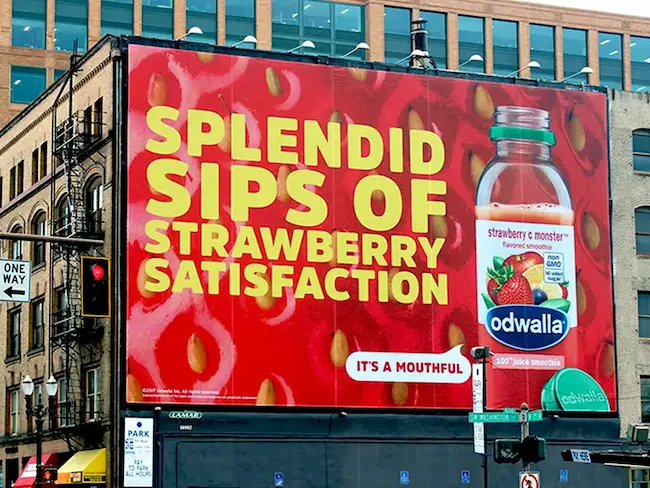
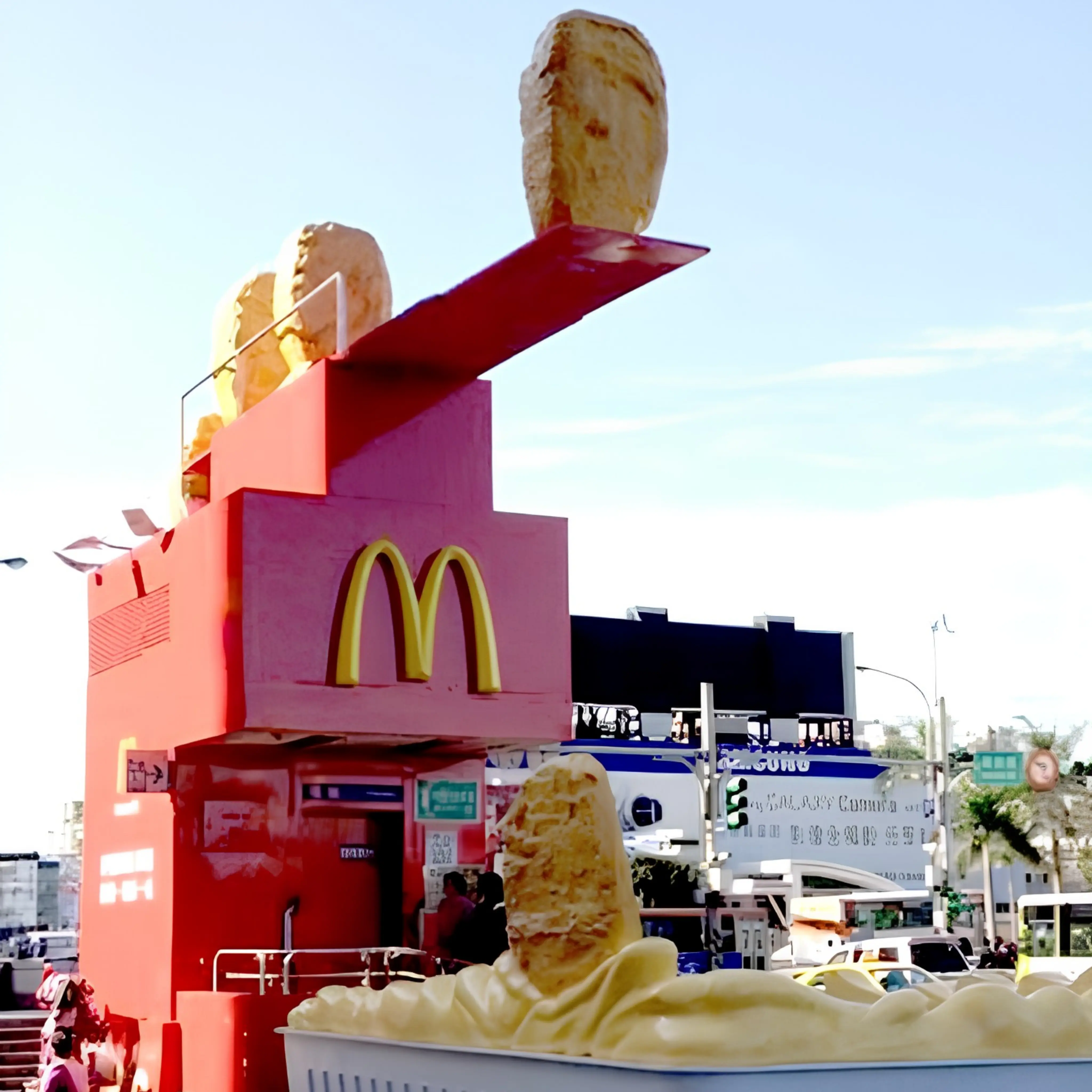
Visual hierarchy tells the viewer what to read first. On a billboard, the first read is usually the image or headline, the second read is the brand, and the third read is the action. If everything is the same size, nothing leads the eye. If the logo is too small, people may remember the joke or image but forget the advertiser.
Use scale deliberately. Make the most important message dominant, keep supporting copy minimal, and leave enough negative space for the design to breathe. Empty space is not wasted space when it makes the message easier to understand.
Write for Speed
Billboard copy should be short, concrete, and easy to process. Avoid long words when a short word works. Avoid internal brand language that the public does not know. Avoid cleverness that requires a second reading unless the site has very high dwell time.
A useful test is the three-second test. Show the creative briefly and ask what people remember. If they cannot name the brand, message, and action, simplify the design.
Design for Contrast and Legibility
High contrast is not optional. Thin type, busy photos, soft gradients, and low-contrast color combinations can look polished on a monitor but disappear outdoors. Use large type, simple shapes, and clear hierarchy.
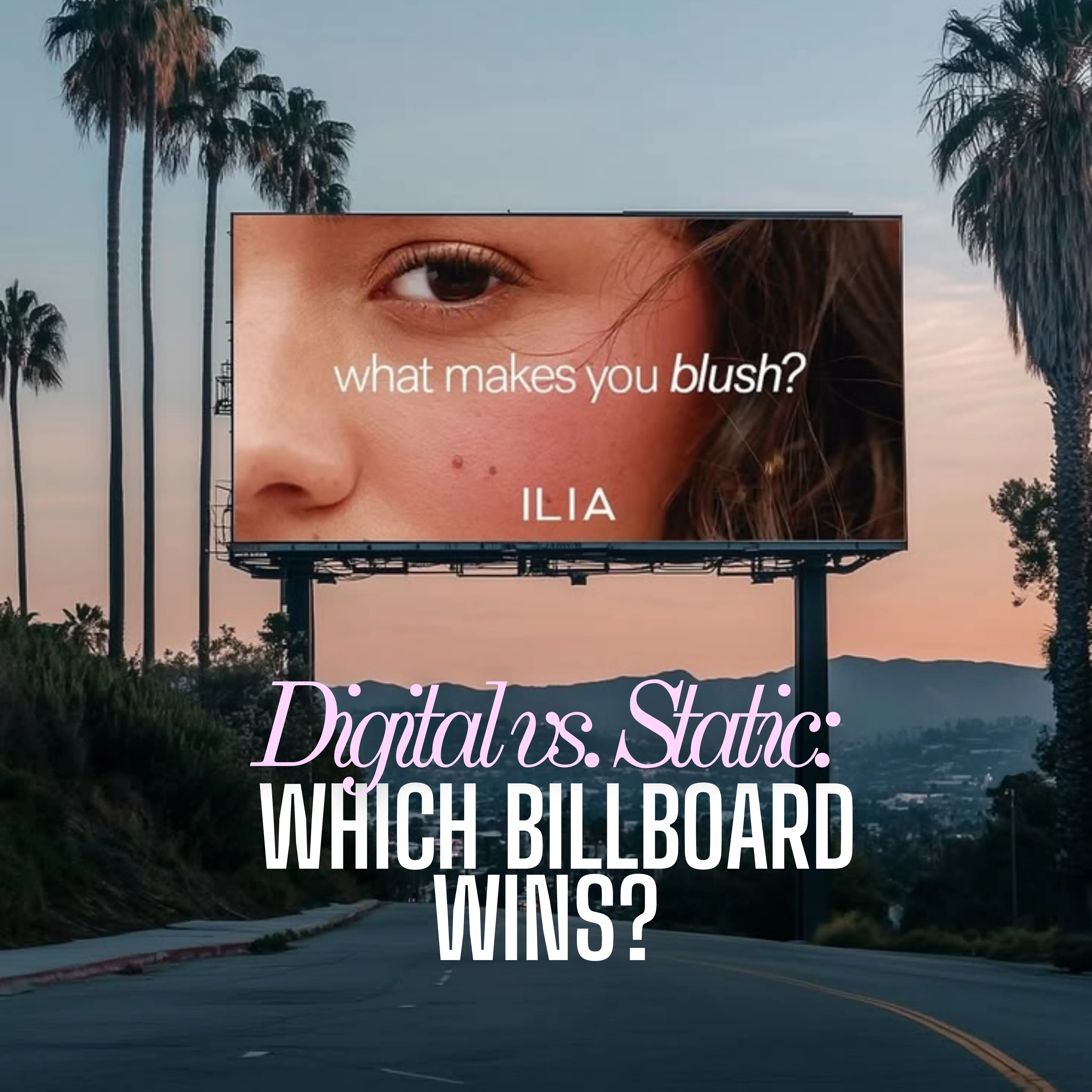
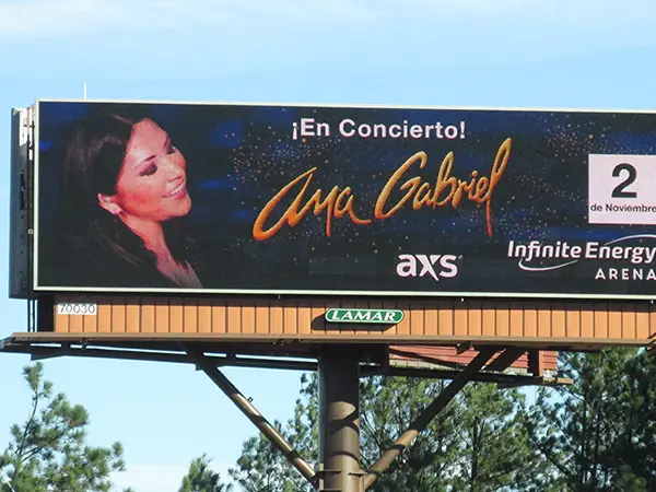
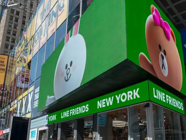
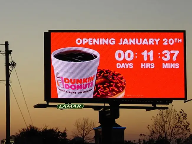
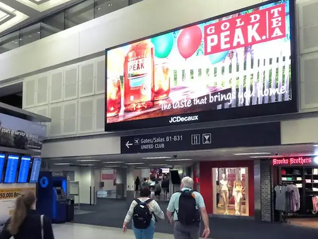
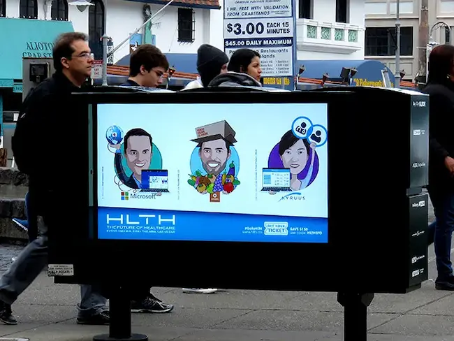
Digital billboards need special attention because brightness, ambient light, and rotation affect readability. For format choice, read BM Outdoor's Digital Billboards vs Static Billboards guide.
Make the Call to Action Match the Medium
A billboard call to action should fit what the audience can realistically do. "Next exit" works when the board is before the exit. "Search BM Outdoor" works when the brand name is memorable. "Tour this weekend" works for real estate when the dates are clear. "Call now" works better for slower traffic or service categories where phone response is natural.
A weak call to action asks for too much: scan, follow, compare, read, remember a long URL, and use a promo code all at once. Choose the action that creates the least friction.
Use QR Codes Carefully
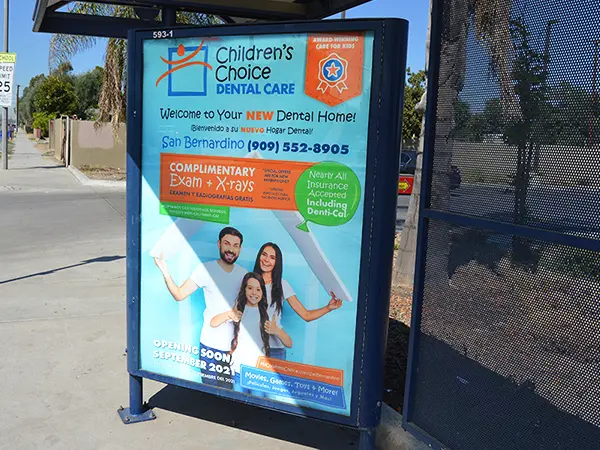
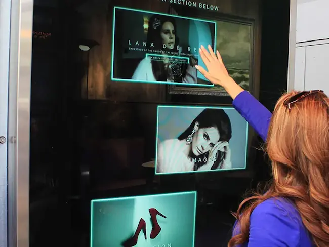
QR codes are not automatically bad. They are bad when they are used in the wrong environment. A person walking through an airport, mall, campus, transit shelter, or parking lot may scan. A driver on a highway should not be expected to scan.
For fast roadside boards, brand search, a short URL, a memorable phone number, or a clear location cue usually works better. The billboard should make the next action obvious without demanding unsafe behavior.
Match Creative to the Business Goal
Restaurant creative should create appetite and make the location easy to understand. Real estate creative should sell a place, price point, or tour action. Franchise creative should connect the national brand to a local unit. Healthcare creative should be simple, accessible, and compliance-aware.
For industry examples, review BM Outdoor's guides for restaurants, real estate, franchises, and healthcare and pharma.
Proof the Board Like the Audience Will See It
Do not approve billboard creative only by looking at a large mockup. Shrink it. Blur it. Step back from it. View it for three seconds. Place it over a photo of the actual board location if available. Check the design on mobile and desktop, but remember the real test is distance and speed.
BM Outdoor Takeaway
Strong billboard creative is simple because the environment is demanding. One idea, one visual, one action, and clear branding will usually beat a crowded design. To plan creative around real inventory, use the BM Outdoor quote form and share your market, format, and campaign goal.
Frequently Asked Questions
Many effective billboards use about 7 words or fewer, but clarity matters more than a fixed number. The audience should understand the message in a few seconds.
Use large, simple, high-contrast type. Exact size depends on the board, distance, speed, and format, but small text should be avoided.
Use QR codes only when the audience has time and safety to scan, such as pedestrian, transit, mall, airport, or parking environments. Avoid relying on QR codes for fast highway boards.
Effective billboard creative has one idea, strong visual hierarchy, high contrast, a memorable brand cue, and a simple action or takeaway.
A phone number can work for local services if it is short and memorable, but many campaigns perform better with brand search, maps, or a short URL.
View the design at small size, blur it, show it for three seconds, and check whether the brand, message, and action are still clear.
Yes. Digital billboards should use high contrast, simple frames, clear branding, and creative that works even if the audience sees only one rotation.
Ready to advertise outdoors?
BM Outdoor plans, buys and prints OOH campaigns across all 50 states. Request a free quote with no commitment.




Comments
Be the first to comment.