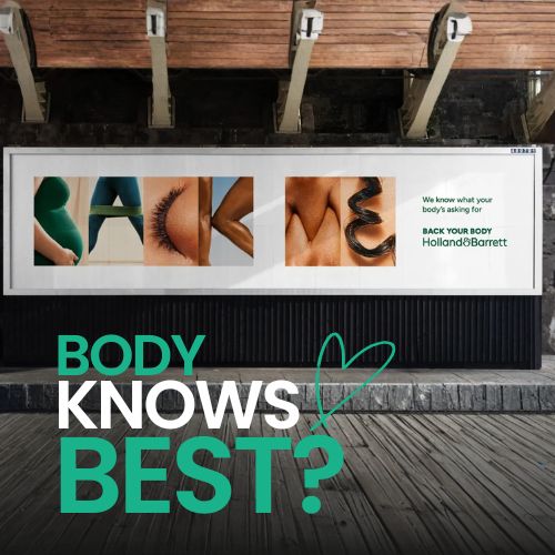
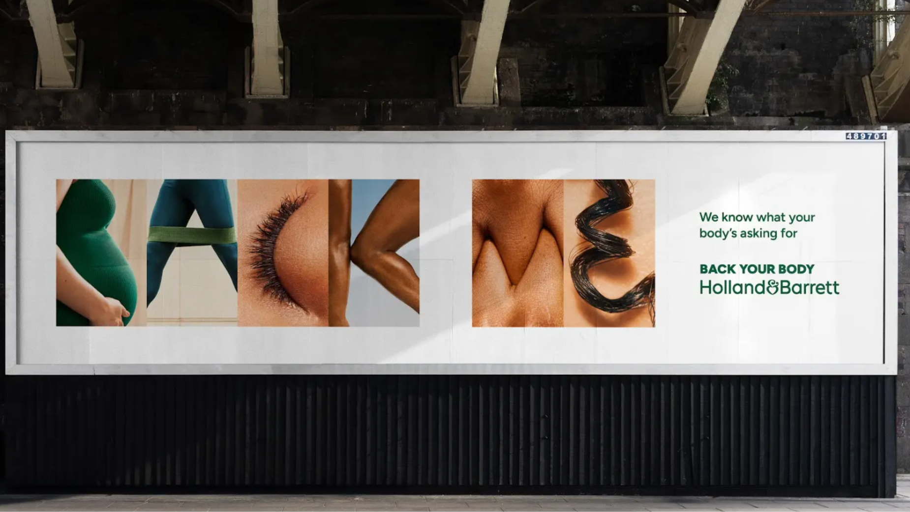
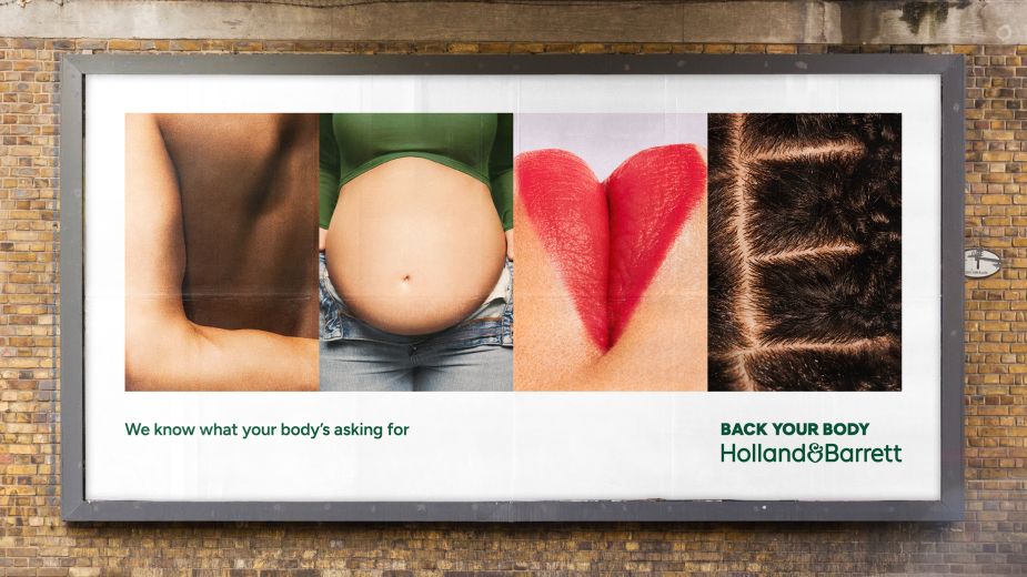
Body Language Becomes the Big Idea
If a brand platform is built around backing your body and giving it a voice, the outdoor campaign has to make that idea visible immediately. That is exactly what Lucky Generals does in its first OOH campaign for Holland & Barrett, placing the body at the center of the creative so it can quite literally communicate what it wants.
The Campaign Extends “Back Your Body”
The campaign builds on Holland & Barrett’s recently launched “Back Your Body” platform. Rather than treating OOH as a separate execution, the work feels like a natural extension of the broader brand world. The message is clear: the body is not just part of the story, it is the main character.
A Design System With a Distinctive Point of View
A major driver behind the campaign is the design system created by Lucky Generals’ design team, led by executive design director Nathan Crawford. Developed as part of a wider reimagining of the brand, the system introduces a more distinctive and recognizable visual language that gives the platform consistency and personality.
Typography Turns the Body Into Communication
One of the most striking elements of the campaign is its typography. Real body parts are used to construct letterforms, transforming the human form into a communication tool. This creative choice does more than add visual impact. It reinforces the central idea of the platform by making the body itself the hero of the message.
Photography Focuses on Real, Observed Movement
Shot by photography and directing duo The Masons, the campaign captures bodies in motion through real, observed moments. From stretches and steps to small everyday gestures, the visuals avoid exaggerated wellness clichés and instead embrace something more human, honest, and relatable.
Moving Away From Performative Wellness
That shift in tone matters. Instead of idealized, overly polished imagery, the campaign chooses natural and unposed moments. This gives the work a more grounded emotional quality and makes the brand feel closer to everyday life rather than to unattainable wellness standards.
A Cohesive Identity Across Every Touchpoint
The design system also creates a stronger overall point of view for the brand. Alongside the photography style, it sharpens Holland & Barrett’s use of existing assets through bolder typography and a more refined color palette. Together, these elements help build a cohesive identity that can work seamlessly across OOH, retail, digital, product, and both internal and external communications.
Why the Campaign Works
What makes this campaign effective is how clearly it aligns creative execution with brand strategy. The body is not treated as decoration. It becomes the medium, the message, and the visual anchor all at once. That gives Holland & Barrett a campaign that feels both distinctive and deeply connected to its platform.
Summary
This campaign stands out because it turns the brand platform into a visible and memorable outdoor idea. Rather than relying on idealized wellness imagery, it focuses on real bodies in natural motion. The typography, built from body parts, reinforces the message that the body itself has a voice. Combined with a refined color palette and stronger use of brand assets, the campaign creates a cohesive system that can work across OOH, retail, digital, product, and internal communications.
Frequently Asked Questions
The campaign turns the body into both the subject and the communication tool of the message.
It was created by Lucky Generals for Holland & Barrett and shot by The Masons.
Its typography uses real body parts to form letter shapes, making the design feel distinctive and concept-driven.
Because it favors natural, observed, and relatable body moments instead of idealized or performative imagery.
Ready to advertise outdoors?
BM Outdoor plans, buys and prints OOH campaigns across all 50 states. Request a free quote with no commitment.


Comments
Be the first to comment.